Friday, September 29, 2006
open studio
the artists in the sunset - including me!- have made a great brochure which covers just our neighborhood for the SF Open Studios for Oct 21-22 so use the link above to see it and get the map!
catching up is hard to do
i realized I have not been posting for a while. so today i posted notes on my work from the last month. i don't think i can fix the dates so they will all look like today. I hope to review these and create step by step details on how to do the things i'm doing. but for now, just publishing the notes is enough.
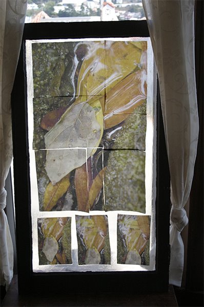
finished first window!
finished first window!
well sorta finished the first window. I'll have to put some glaze on it tomorrow to make it consistent all over.
It looks so much better than the transfer from transparencies. number ne is the color. it's laying on the table right under the original and the match is great! it's lighter right now but the acrylic is still wet.
boy my back hurts!
too much bending over my work.
windows - the kind made of glass and wood!
In addition to working on the cloth book and printing fine art photos to frame, I'm working on this huge project putting images on these four beautiful old windows someone threw out, At first i thought was going to do a transfer with Apollo Inkjet transparencies with Golden's soft gel to the window. but because of the scale i started having problems and because of trying to get it to stick to the glass i started mixing various Golden products. Eventually i made an emulsion by building up layers of gel mix on plain transparencies (it peels right off when you need it) and doing the transfer onto that. I then peeled off the emulsion and adhered it to the glass. but i was never happy with this. 1 i couldn't get a clean enough transfer for the look i wanted - always too much "distress." and 2 the colors were shifting because the transparency didn't react that well with the ink, unstable results again!
So then i came up with the idea of printing onto silk and adhering the silk to the window. I did many tests, worked hard at color correction and eventually settled on silk for Colortextiles. what follows is some of my notes on that process.
I use Photoshop CS to color correct. I have a curve just for Epson's "velvet fine art" paper profile for their R2400. I adjust for the apparent changes i can see on the screen from applying that paper profile. This curve is purely a tonal adjustment: a curve on an adjustment layer in the RGB that adjust midtone contrast and is set to "luminosity." I can transfer that adjustment layer to any image i'm going to print on that paper.
I found that the velvet fine art paper profile works best when i'm printing out using the matte black on a not so matte surface. with Colortextiles, once i apply the paper profile and add the midtone color contrast curve, it matches what's on the screen.
w/ the blumenthal, the paper profile adjustment didn't work. when i was testing it to use w/ the windows (i don't care for projects like the faces of the dolls), i had to apply an additional curve for the difference between what it looked like on the screen and how it printed on the silk. Actually i used selective color because when i used curves i could see the black and white and grays of my test strip were taking on color. when i used selective color, only the color i was adjusting changed.
But it was too much and there was banding -metamerism.
I made a decision about which images to use for the windows.
the original idea was that the images were all different stages of the cycle of earth: rock, sand, rotting plants and renewal in new plants. But when i worked with my old sand images i didn't think they were strong enough to interact with the leaves in the stream, (the rotting part where soil gets made). Also, although I have a ton of rock pictures, many of them are old scans that might not appreciate being blown up to 17 x 25!
Today i found that one of the recent beach pictures i took with the lens baby had a strong design element in the sea weed that interacted nicely with the leaves in the stream.
to that i added recent succulent plant image. now the cycle idea has loosened up a bit cuz of the sea weed in the sand picture. so it was suddenly OK to use a rock picture that's about 1/2 green plants (the rock is a strong orange from the carotene moss very strong colors support the idea of the strong rock) and that the moss showed an advanced stage of break down of the rock. so the concept is muddied. Still this one fit in a design way too.
all the curves and diagonals play off of each other. I put them in a low res photoshop file and messed with the opacity and created a drawing layer to get a real feel for how the shapes and colors interact. I also played with the blending modes, i'm not sure why! but anyway. i feel comfortable with the choice so i can begin the process of preparing the images to be printed on several sheets of silk ($$$$!!!!) after blowing them up and all. once i get the first one done i'll feel more comfortable ordering more silk. I wish i could afford those big rolls ... but it's ok. fitting together the 8.5 x 11 sheets gives me an opportunity to represent window panes on the windows.
(coming soon - why i changed my mind)
peeling of the backing - not!
today i had trouble with one piece of silk, a teenaged face - spent way too long trying to get the backing off the silk.
I had it sit this time at least a week before ironing it as the directions say, and letting it cool. But after i ironed it, the paper and glue did not peel cleanly.
so i worked and worked. I eventually got the back wet to soak off the paper. now it's as hard on my fingers as a transfer from a print on paper using Golden gel! further, all the work i did abraded the pigment on the silk and made scratches. one of the disadvantages of pigments over inks is that they sit on top more and don't sink in as inks do.
Then the next 3 faces, cut from the same page of silk printed at the same time, came right off! AAUURRGGG!!! well i guess i should be pleased when it works but it makes no sense to me when it doesn't.
when i ironed it, i noticed that some yellow stained the cloth i'd put underneath -- just like with the Lazertran for light cloth and i'm thinking the Epson ink doesn't like heat!!!! (actually that doesn't make sense cuz it does not hapen with Lazertran for dark materails which also is heated to peel off the back.)
fortunately the faces on the blumenthal silk are small.
hey you want to buy an unopened roll of this stuff????
I thought i was going to use it for smaller projects but if it's so hard to peel i'm not sure it's worth the effort!
Anyway, as a result of scratching the face, i changed what was to be the picture used as the dolls face for the teenage page. I will use the now scratched up face as a secondary pic. in the background. but by then i was getting careless and sewed the face on right side out so it was wrong side out when i turned it.
no problem, i just painted it with water colors.
6 hours later i will have the next head in the book done. sigh!
it looks good tho.
so i think i'll print out some photos, so straight ahead. no fuss no muss. when one's computer is behaving that is!
more on doll faces
well i couldn't sleep this morning so i got up and finished stuffing all the little hands for the dolls in the book. and then i cut out the first of the faces. ironed the back off the blumenthal silk and sewed it to the tea dyed cotton back of the head.
My concern had been that i'd printed the faces too close together and wouldn't be able to sew the face to the back for lack of a seam allowance. Well i had to sew close to the edge so i sewed over it 3 times. I know from stuffing the hands that if the seam allowance was too small, it would break right through when i stuffed it. and my machine has limited capabilities so the smallest stitch is not so small. It came out fine. it's a smaller head overall than i'd pictured in my head, with no space between the end of the image and the start of the cotton for the back of the head. But it looks fine cuz it's a grown up head. i think for the baby and little kid faces i will be sure to print with a seam allowance in mind so the head can be rounder and the face set off from the back.
My concern had been that i'd printed the faces too close together and wouldn't be able to sew the face to the back for lack of a seam allowance. Well i had to sew close to the edge so i sewed over it 3 times. I know from stuffing the hands that if the seam allowance was too small, it would break right through when i stuffed it. and my machine has limited capabilities so the smallest stitch is not so small. It came out fine. it's a smaller head overall than i'd pictured in my head, with no space between the end of the image and the start of the cotton for the back of the head. But it looks fine cuz it's a grown up head. i think for the baby and little kid faces i will be sure to print with a seam allowance in mind so the head can be rounder and the face set off from the back.
doll faces
I'm making a fabric book that has little rag dolls in it. their fasces are photos printed out on the silk.
I'm using some the baby pictures i had scanned in. They are some old black and whites that i then made look as tho they were hand colored using Photoshop.
I remembered my previous efforts at actually hand painting a print and i knew i needed that undo button on the computer!
I used a painting layer. i then blended the layer using "color" or "soft light" blending mode for the layer. One got complicated around the eyes and i ended up having three layers, one with just the eyes repeating, blended with "soft light."
of course i spent way too much time fixing up the old photos. I'm also using images of grown up shots that are mostly old IDs i scanned in. one was a NY driver's license which puts a moiré pattern over your face. many of the lines for the face are lighter than the moire pattern cuz it was over exposed. But it's the fading away that i liked about it, so i actually spent time erasing these lines so you could make out the face!
OCD and tiny threads!
Ok be truthful, all you who work with this silk you can print on -- how much do you fuss with the little tiny threads and hair like fuzz on your silk????
This is definitely bringing out the OCD in me! ha ha ha ;-}
I'm getting gorgeous prints on the chine that i got from Colortextiles for my window.
i'm excited!
I 'm simultaneously sewing the little hands for the dolls for the cloth book. I can sew and stuff an arm in about the time it takes to print out a panel for the window!
colortextiles and light
my Colortextiles samples came and i really like the crepe de chene "14" for the window project. it's got the right amount of variation in the thread and seems to throw more light. I think I'll use the blumenthal for cloth books cuz it seems stronger.
As i was falling asleep last night i saw one side of the window with silk and the other with a gel transfer.
humm... i wonder how that would really look.
I signed on to the fabric group at yahoo groups and i'm reading through old posts.
I'm going to move my studio into the living room and the living room into this room, which is the dining room. I will get alot of resistance but i'm in this house all day and they are here for a few hours everyday. Morey's "study" (my son's bedroom when he's not in college) is bright and sunny (when there is sun in this fog belt) and it has access to the deck. my daughter's room is twice the size of our bedroom and she pretty much has exclusive use of the family room, which is the same size.
The dining room where my studio is has no natural light. it's window looks out to the front stoop which has a roof and a gate. the stoop has a sunroof but it doesn't let much light through.
can you tell i'm shoring myself up?
more on printing on blumenthal silk
this morning i ironed the sample from last night and pulled off the backing. it looks lighter, and seems to have left behind some yellow, but i don't miss it.
so i might only want to reduce the ink desity only 25% - depending on the purpose of the piece.
i found it sticks to the glass nicely when i use a mix of Golden's soft gel gloss and GAC 200. I'm testing to see if it looks a little more translucent if i wet it first so it absorbs more water from the gel. But it's tones better than the lazertran for looking glowy in the light.
I did loose some detail. Should i do extra sharpening? hum...
i also ordered sample packs of the Colortextile cotton and silk. I went ahead and ordered some ink from them as well cuz they have a baseline shipping cost per order. I don't have the cash flow to order a whole $100 worth of stuff to get free shipping. Sheesh! at amazon it's only 20!!
and i am interested in the organza but i have to wait til next month..
color correcting blumenthal silk
well I spent a whole lot of time messing with the curves in Photoshop, trying to get the color right on the blumenthal silk. I have gone full circle and i'm really scratching my head on this. basically one way to fix a picture is to take a curve on an adjustment layer (if you have elements use selective color i suppose -but the curve is so neat to look at!) and make the screen look like the print out and then make a new adjustment layer curve with the opposite info! but the bottom line is that something that seemed to have stopped working (switch input/output numbers) is working again.
an interesting thing is that curves is represented as a line indicating from 0 (darkest) to 255 (white) on a pure diagonal. if you pull the line up from the mid point, you make the middle pixels lighter and if you pull them down they get darker.
So you'd think the "opposite" of one curve would look like it's mirror. but some how it doesn't. instead it seems that it's upside down and backward! so i'm shaking my head and got my son in to help me think it through.
Anyway. the main adjustments i'm making are tonal just the blacks and whites and grays. i'm learning that the color adjustment can be much less if you fix the tonality first. this is easier for me to do now that i work with this nifty test strip (little squares of white to black in 21 gradations) with a color gradient rainbow thing. I add a swath from the picture i want to print.
i can say for sure that i have to reduce the ink 33% --that really helps (BTW since writing this i have found that silk that i cut and put in a plastic bag and got back to a couple of weeks later did not need the ink reduction.)
well the fix just came out of the printer. it looks ok but i have to wait to see it in the daylight (or should i say fog light!) to be sure. the light in this room is bad. I can see that, from reducing the ink, the dark colors look better and the light colors got too light.
to do the fix in levels slide the mid point slider to the left to lighten the midtones and then on the output at the bottom move the darks slider to the right to lighten the blacks. you could do it in selective color too where you'd lighten the blacks and grays.
instability
the blumethal silk is acting completely different!
oh boy! i don't know what's up but my new roll of blumenthal is acting completely differently from (than?) the stuff i had before. I guess the main difference is that i didn't worry about how much ink was going down before, set it up like it was paper. but my new roll is clearly unhappy with how much ink is going down! ink everywhere, what a mess!
I'm wondering if the product has this much variation or if the silk I had gotten from my friend was really old or something.
the good news is that except for the extra ink, which i know how to solve, the color is looking good with little adjustment.
in other words it seems to have the right colors but just too much of it all.
i have to wait for it to dry enough to cut it off the roll so i can print the next thing.
as usual i ran into some strange restrictions with the Epson R2400. I'd been using the borderless manual roll setting and feeding cut silk through the roll slot even though it wasn't on a roll.
when i got my new roll i decided to set it up like a real roll. BUT Epson's roll paper sizes don't include 8.5!
Seriously.
i put the roll handling things on the ends of the roll. these things let the roll spin and attach to the back of the printer. they attach fine to the roll but they won't then attach to the printer because the tabs on them don't line up with the slots on the back of the printer.
the roll won't fit on the printer unless it's 8.3 inches! every roll out there is .2 of an inch too big!!!
what are they thinking?
so, being too lazy to start cutting sheets, i tried what i thought was a shortcut. whenever i'm lazy and try a shortcut, i almost always end up doing twice as much work.
this was one of those times.
i left the roll in the roll handing things and put that on a shoe box so the roll sat above and behind the roll feeder. i put the cut edge in the roll slot, just like i'd done with the cut sheet. The idea was that the silk would feed into the back roll slot but with out attaching the roll to the printer.
the Epson took the paper and had trouble lining it up, which it does sometimes. but i couldn't get it to reset properly, pushed the wrong button and instead of it backing up to try again, it starts pulling out _all_ the silk off the roll! O NO!!
a real I Love Lucy moment if you know what i mean.
it gets to the end of the roll and the printer starts spinning like crazy because the silk is firmly taped to the end of the roll and won't come through! The printer is not going to stop til all the silk is thru. i jumped up, reached over and yanked the silk off the roll while quickly ripping the tape off the end of the silk so it wouldn't go into the printer and gunk it up!
So there was all my silk laying curled up on my printer table.
I rolled it back up, put it back on the shoe box, and fed it in the Epson again. yes i _am_ a glutton for punishment.
But before going any further i decided to read the rest of the directions. The directions provided by Epson show being able to choose a banner setting after setting the print perimeters. there is one option option for banner and one for separate pictures with spaces. this tells the printer when to stop. It allows you to to print your prints print right next to each other with no spaces in between.
but i didn't see this option. so i messed around and determined that this option only becomes available when you choose "banner" in page set up first. (so you can choose banner there and change your mind in the next dialogue?) a regular choice of manual roll paper doesn't give you the banner choice.
Ok fine. i chose the banner setting and you won't believe this, i lost the velvet fine art setting! all the others with the good paper profiles have become grayed out as well. what the ___! ?!
How on earth can the printer's ability to stop at a certain point and not advance the paper have anything to do with the paper profile used?
So with a big sigh i fed the paper in there anyway, and this time it set up fine.
it actually fed pretty nicely, until the end when it started spewing all the silk out again! OMG! so reached over and pushed the right button this time and it stopped, and started backing up! oh no! i'm imagining that it's going to back right up into the printer and gunk everything up cuz there's all that extra ink sitting on top of the silk!
amazingly it stopped at what looks like a nice pace to start the next picture if i'd actually sent a full 11 inches to the printer. but the epson believes it's jammed. and i don't want to press anymore of those buttons till i get the over saturated silk off the end.
well i think writing this gave it time to dry. back to work.
yeah it is kinda fun, although right at the moment that i think i'm about to trash my printer.
i'm not laughing!
blumethal silk
I've been testing the blumenthal silk on my Epson 2400 all morning. the only paper profile that comes close to looking good on the silk is the "velvet fine art" setting. I'm on a roll getting the color as i want it and conquering the ins and outs of the back manual feed thing. (i couldn't get to "velvet fine art" without it. )
I just hit the wall tho -- the last print was off and i'm too tired to figure out where to go next.
I wanted to mention that i think it's really interesting that when i print out the tests the colors shift but not the blacks and whites and grays. I use a color test strip that has a section of blocks of B&W from white to black 22 steps, and a ranbow of color, plus little pieces of chalenging art of mine.
when i print it out no color is introduced into the B&W blocks. so if i try to fix a color shift globally i begin to introduce a color shift into the grays! so i think that leaves fixing it with selective color only.
tea dyed fabric
i just made two of my very own tea dyed fabrics. very cool. one is for my dolls that go in the cloth book the other is some lace i'd cut from a curtain that was way too white to be attractive.
the lace i dyed in plain old tea which came out a mellow tan. the cotton i added a bit of chai tea which made it much pinker.
yesterday i finished deconstructing the canvas closet organizer and started the cloth book with the main portion - sewing some batting onto one side, stitching where the page breaks will be. I'm making it a concertina (continuous zigzag) but floppy, in the style of a baby book i saw once. I started working on an image from when i was recovering. my mom took it while i was taking pictures at muir woods.
I like the symbolism, but it's too small not enough info so yesterday's photoshopping goes in the trash. I have others.
Tuesday, September 05, 2006
working with cloth
i just made two of my very own tea dyed fabrics. very cool. one is a plain cotton for my dolls that go in the cloth book the other is some lace i'd cut from a curtain that was way too white to be attractive. I may use some of it in the book and save some for another mixed media brojest.
the lace i dyed in plain old tea which came out a mellow tan. the cotton i added a bit of chai tea which made it much pinker. I tried dyeing a ssoft stretch terry cloth but it ended up just looking like a dirt rag. I tried dyeing it two different times. I don't understand the difference. I'm going to try to rescue it with a coffee dye. I wonder if i can use instandt!
yesterday i finished deconstructing the canvas closet organizer and started sewing together the cloth book using the main portion of the canvas - sewing some batting onto one side, stitching where the page breaks will be.
I'm making it a concertina (continuous zigzag) but floppy, in the style of a baby book i saw once. I started working on an image from when i was recovering. my mom took it while i was taking pictures at muir woods. I like the symbolism, but it's too small not enough info so yesterday's photoshopping goes in the trash. I have others.
Ok be truthful, how much do you fuss with the little tiny threads and hair like fuzz on you silk???? This is definitely bringing out the OCD in me! ha ha ha
I'm getting gorgeous prints on the chine stuff i got from color textiles for my window. i'm excited!
oh, check out this art in a real life gallery:
here's a mixed media artisit who incorporates old photos of her family in her work
http://www.bquayartgallery.com/archive/rayner2006.html (click on the images for bigger versions).
I particularly like the cyanotypes and the looking glass.
and
http://www.bquayartgallery.com/archive/rayner.html
some of her older work.
the thing that looks like a candelabra is filled with wax encased photos of her family.
here's a different artist at the same gallery.
http://www.bquayartgallery.com/archive/austin.html
I see the note that the piece is sold and i really want to know for how much!!
Subscribe to:
Posts (Atom)