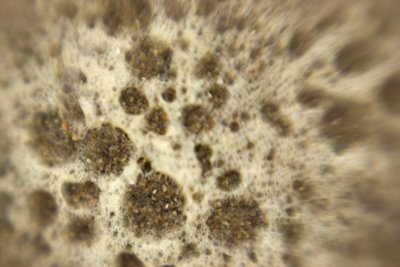
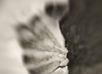
This morning i went down to the cold foggy, windy beach with my camera, lensbaby attached, and took sand pictures. Fun to revisit the subject from the warped perspective of the lensbaby. But i had the strongest macro lens on and that meant being inches from the subject. So i'm down on my knees in the wet sand, keeping one eye and both ears on the surf so i can jump up when the occasional larger wave sends more wet bubbles my way. I got out of the way every-time but i was wet and very cold at the end. The pics are interesting. see it you can see it with the profile - maybe open in photoshop too see the warm colors - the foam i was shooting was yellower than the foam that disappeared quickly.

I've been so wrapped up in working on my widows. following my teaching advise to test your application. I thought i had a great solution to the challenges of transferring photos to the glass when i decided i did not like the look at all and now i've switched to other materials. So i'm back to experimenting before i print out and transfer. the interesting part is trying to get the color i want. When i first thought of transferring images it was because i wanted to move a picture with perfect color from a paper with controllable attributes like a paper profile and consistent professional level paper production to a surface that was more artistic but without the controllability - watercolor paper, canvas etc.
The method for doing that is hard because it involved rubbing off the paper from the back of the acrylic gel emulsion. this killed my hands. So i started working with overhead transparencies and lazertran. they don't have profiles but they seem well made. But with the overhead transparencies i had problems getting clean transfers when i worked big, so i switched to lazertran for my big project. I'm currently in the middle of doing color tests. changing one thing at a time, printing out swaths of color waiting for things to dry, then transfer it and wait for that to dry and then compare with the image on the screen. painfully slow. But the color is important to me. when i worked with the overhead transparencies the first time i was so excited about getting the image to stay on the window that i did not work to correct color problems. but then it slowly got to me, how it was off. Also that it was too distressed ( places of lift where the ink does not transfer). I feel like maybe i'm crazy cuz no one else i know tests this much.
maybe i like testing! i'm the daughter os a scientist afterall ya know!
I have also been working on generating a handout that was supposed to be given for my last workshop. Oh boy, the dangers of cut and paste! the material is mostly a compilation of information at the Golden and Lazertran websites, with some quoted material from the yahoo group, with my running commentary throughout. Boy is it long! It was so unwieldy that i had to actually make an outline to determine the organization i'd given it and rewrite the outline to get things is a more comprehensible order. I can't remember the last time i outlined something!!! I guess i'll ost it here when i'm done.


