Friday, December 22, 2006

the winter beach


this is the first winter i've been this close to the pacific. I can go every morning just to watch the waves. It so exciting the way that the sea rises and reduces the beach. there's really no place left to walk, even at low tide you can get cut off. I went down from the bluff at fort funston through the beach access and followed a young fellow as he scampered over some rocks to the next section of beach. by the time i'd picked my way over the rocks, he was long gone to the next section. then the waves were coming fast and high and the rocks i'd just climbed over were under water! now i'm not so agile any more and i got kinda scared as i climbed over a higher section of rock and slid down the other side on my tush. with the seat of my jeans wet and sandy i saw that a cement protrusion was about to become a major roadblock if i didn't hustle! the tide was coming in fast so i jogged down the beach past the cement ruin to the safety of the bluffs! fewie! so this dizzy shot is fitting cut that's how i felt as i worked my way back up the bluff.

time moves faster when the days are so short!


I just can't keep up when the daylight hours are so short!
But i did make it to the beach and got some wonderful flowers before it got too darn cold. this one is a more delicate yellow. others that i took were so deeply yellow that i could not get a good shot, it must be a limitation of the digital format cuz it's maxed out on the yellow and all detail was lost in much of those petals. This one was much more delicate. and i call it follow home because i feel like i could crawl right up in there!

Wednesday, December 13, 2006

show at Adath Israel was a great success

i was so busy getting ready for the show at Adath Israel, my local synagogue.
it was a great success!
i donated my latest mixed media project (pictured here) to the raffle. we raised over a hundred dollars through the raffle and more through sales. i donated 10% of the proceeds to the shul.
this was such an exciting event for everyone involved. the new Rabbi, Joshua Strulowitz, is revitalizing the community by starting educational opportunities, bringing in families with young children through a play group, and creating more opportunities for socializing - this show being the first of many events to come.
i was thrilled with the feedback about my work and having a chance to sell a few things - to know my work is out there. the toughest part was the artist's talk. I spoke directly about the spiritual connection i feel in my work and that's hard to talk about. i don't have words for that. everyone listened and i got through it.
wall hanging
the wall hanging is made with a lovely gold material i got in and India Saree shop in Berkeley (but it is much heavier than a saree). the image of a flower was printed on silk - a luxurious silk with some texture -and the hebrew words were printed on silk as well. the Hebrew says "east" in English because it is to be hung on an eastern wall so you know which way to face when you pray at home. The silk is from colortextiles and it's called silk lines.

Wednesday, December 06, 2006

now i know how Jackson Pollock got his start!


now i know how Jackson Pollock got his start!
he discovered that the paint companies were ripping him off by making it seem like the paint cans were empty when in fact there were gallons of paint left inside. but the only way to get the paint out was to poke holes all over the cans and whack them, throwing paint every which way in his studio. some of it landed on a canvas and he kept it a secret cuz he figured punching holes in the paint can was probably a copyright violation for reverse engineering them!

similarly i now have Pollock-esque scarves having discovered that those "empty ink canisters from Epson don't have a few drops left when they tell you it's empty. there's the whole Hetch Hetchy Reservoir in there!
i started out all controlled taking little drops of pigment out of the holes where the air locks are on the bottom. but soon they were leaking everywhere - especially that crazy cyan. soon enough i was feeling my anger boil and my sense of humor take over and i started whack the so called empty canister onto the silk scarf i was working on.
talk about abstract!

well it won't sell but i will wear it proudly to proclaim that i did not reverse engineer it, i got what was rightfully mine!

in this drawing (from MOMA's website - follow link in the title to this post) Pollack has discovered that the black and sepia ink containers have hidden reserves of ink the company never intended he be able to use. just pay for.
Jackson Pollock. (American 1912-1956) Untitled (1951) Black and sepia ink on mulberry paper Gift of Lee Krasner in memory of Jackson Pollock © 2006 Pollock-Krasner Foundation  Artists Rights Society (ARS) New York
Jackson Pollock. (American, 1912-1956). Untitled. (1951). Black and sepia ink on mulberry paper, 25 x 38 3/4" (63.5 x 98.4 cm). Gift of Lee Krasner in memory of Jackson Pollock. © 2006 Pollock-Krasner Foundation / Artists Rights Society (ARS), New York

Tuesday, November 21, 2006

fort funston


at the south end of Ocean Beach in San Francisco is some beautiful dunes that rise suddenly out of the beach. at the top a fort was once built and garrisons were dug in and we were safe all during WWII. of course the army sort of tore the place up, but it's been turned into a park and many areas are being restore - with native plants and protecting nesting birds. I love to walk up from the beach, winding through the dunes and turn around and go back before it get crowed with dog walkers and deserted army structures. This is where i've been taking pictures on my morning walks.

Thursday, November 16, 2006

do you shot like a fashon photographer?

recently someone asked me if i shot like a fashion photographer. They pictured me clicking away rapidly. i guess there thought was i'd be more likely to get the shot that way. It really gave me pause because i think it told me something about how my abstracts are perceived, or at least by this person, who seems like a regular person. I thought that the idea "photographer" for most people is a glamorous one, seems like an easy job capturing beauty. I know that even fashion photographers work very hard, i'm not saying i think their work is easy, i think it's perceived that way.
I think this may be because the average person taking a picture has a light weight point and shoot. they take pictures holding the camera in one hand, with out getting down on their knees or climbing up a ladder to get the shot. and they don't fuss over focus or aperture.
also for them it seems that the final shot must be due to sheer luck, because that's how it is for them. if the shot comes out they were lucky.
My work is not glamorous, easy, or a matter of luck!
I take a moderate amount of pictures very, very slowly. I usually have to hike to my subject, get up before dawn or go out in the rain, fog, windy storm to get the light and wetness i want. i get down on my hands and knees because the most interesting stuff is way down low, or it looks better that way. My cameras used to be so heavy, with my arthritis i could never do it now! I love digital for lightening things up, but still what i'm wielding weighs three or four times what the point and shoots do, what with lenses and all. So my wrists really begin to ache.
Some of my process i think is interesting. when i do macro i focus by moving my body the minutist amount. if i breathe the focus is lost. so i end up holding my breath alot. So i'm down on my knees in the mud or the damp sand curling up with a plant or rock or whatever, holding my breath and swaying tiny, tiny bits! Every now and then i exhale really hard - cuz i got the shot, but then that fogs up the camera's viewfinder. (then you may see me lift the camera over my head and wave it to clear it while i freeze the rest of my body to hold the place.
for me, getting the shot is not luck. i plan every shot i take. i take variations because it's hard to tell what exactly the shot will look like - how to best communicate what i'm trying to say. I compose the shot; as i teach my students, i look at everything in the viewfinder to make sure i have the subject where it should be and there's no distracting elements or relationships that will look weird in three D. (like a telephone pole coming out of someone's head!) i track the light so i know i need to change my f-stop or speed, and then i focus.
yes even with those blurry abstracts i spend a very longtime focusing. it's really hard to get just the edge of the leaf in focus! I work with an extremely small depth of field (which is why breathing can blow my focus). and with the lens baby i'm not twisting the nob i'm squeezing the bellows toward the camera, which takes more hands than i have to hold it perfectly still while i squeeze off the trigger.
I guess this explains why i get self conscious when i shot with other people around. I look strange working!

Monday, November 06, 2006

working with Hebrew letters

I with now that i had a Hebrew word processor on my computer. I've always relied on the very simple set up on my Mac to write in Hebrew, but now I am struggling with it's quirkiness. I have these cards that i want to add Hebrew test to, and it should be simple enough to write it up, print it on velum and put it on the card. however, even tho i have Hebrew fonts and a computer capable of typing backward, i'm pulling out my hair as it does weird things. mostly textEdit refuses to leave the punctuation where i put it and it messes up when ever it starts it's own new line. At one point i tried to see if i could use illustrator (it couldn't find the Hebrew fonts) or Photoshop. Photoshop is ultimately the right program to use because it doesn't even think about moving the test to a new line, it leaves that to you. but i'm going to have to retype everything i typed today, because it can't think in a reversed direction. so if i copy and paste a line of Hebrew text into it, the letters are all facing the correct way, but every word runs backward. I think it's because it took the sentence and ran it backwards.

in English it would look like this: !taht pots uoy yeH
so you can see that's a problem!

I've been want to make these cards for a while and now i have a show in my synagogue for Chanukah, so i have to get them done!

Friday, November 03, 2006

my biggest transfer yet!


this work still in progress. yet i really wanted to share because i feel it's going so well.

it is on a 16 x 20 canvas board with the transferred image on top of handmade paper that is very textured. the ink has been transferred from an image printed with ultrachrome K3 pigments onto Epson's enhanced mat paper with Golden's Soft Gel Gloss. additional technical aspects of this transfer are discussed on an earlier post, the link above (in the title) will take you there or click on "doing transfers again" in the side bar.

if you look closely you can see areas where the image is very clear and other areas of "distress". i hope i sharpened the photo i took of it enough so that you can see what's going on. there are several different kinds of distress. i have to decide what part is effective and therefore should leave alone and what part is distracting from the effect i want and therefore i should continue working on those areas.

When i'm done with that i plan to continue layering media. i have additional handmade paper, natural elements, and perhaps a cyanotype or cloth elements. i can't describe the final work and i'm not fixed on one result yet. but i want the viewer to feel as though they are standing under that mimosa tree in the rain with me!

Transfer Technology Workshop for Photographers and Artists

daydreaming arts' announces another
Transfer Technology Workshop for Photographers and Artists

Whether you are a fine art photographer or an artist who would like to incorporate photographic images into your work, transferring photography and other images to unique surfaces will awaken your creativity.

At this workshop you will try several methods of transferring inkjet images onto canvas, watercolor paper, wood, glass, cloth, and found objects. We will take a look at the methods that work best for photographers and mix media artists, preserving your color intent, creating archival works of art, and integrating transfers into your current work. Some processes require heat or water: some need a great deal of rubbing and some need none at all. You can mix media to create different effects on different surfaces.

You will learn the how transfer technologies work, what media and processes influence the results - and why. A process can retain a sharp image, or create a distressed look or even a stretchy emulsion. You'll gain information about the properties of the media and how too experiment in ways that work toward repeatable results! At this workshop you'll create several projects using different methods.

You will come away from the workshop with several completed projects and the ability to ask the right questions to develop a unique process that meets your artistic needs.

Come ready to experiment in a nonjudgmental atmosphere designed to inspire and motivate!

This workshop was developed at the suggestion of many visitors to kayla's show in June. During the October Open Studios this came up again. It's essential to keep the workshop small -- so sign up early! the workshop is likely to fill up fast!

Workshop details:
Cost: Early registration by Novemeber 10th fee: $65.00; materials fee $10.00*
When: Sunday November 19th: 11 am to 4 pm
Where: daydreaming arts studio in The Sunset district in San Francisco.
How: e-mail kayla at: kaylagarelick@mac.com

You will receive an e-mail with payment options and a list of tools to bring. daydreaming arts provides transfer materials and receiving surfaces. You may bring your own ink jet prints, use my images, and if you sign up early, you may send images that will be printed onto special transfer papers for use during the workshop. You may want to bring some surfaces with which to experiment.

About the workshop leader:
kayla garelick is a self taught photographer and mixed media artist who has shown her work locally in San Francisco, Berkeley, Albany, El Cerrito, and Richmond. She has experience teaching adults, teens, and children. She has a Masters in Education from Bank Street School of Education. For more information please see her resume at: http://home.comcast.net/~daydreamingarts/resume/artistsResume.htm
kayla believes in experimentation and problem solving. She shares her explorations in a running record in the blog: http://daydreamingarts.blogspot.com/ . Her mom is a scientist who has taught her the importance of record keeping and patience!


kayla garelick
kaylagarelick@mac.com
daydreaming arts
http://daydreamingarts.home.comcast.net
http://daydreamingarts.blogspot.com/

*a separate materials fee in necessary for retail tax purposes.

Wednesday, November 01, 2006

one year on Blogger!


i just realized that yesterday was the one year anniversary of my blog here! boy what a long year!

Walking on the beach with my lensbaby

I guess i'm feeling subdued. the weather is turning colder and the wind is picking up at the beach. each day the chaparral; changes. I don't think most of the plants loose their leaves, but they turn colors and die back. It's really beautiful. getting down on my haunches and sticking my camera and nose down into the low growing succulents too see them as we normally wouldn't, it's a magical feeling; like being inside a secret. with the lensbaby it's even more like fantasy. i see the lens breaking apart the light that the plants are reflecting back at me. I'm ever aware that what i capture is reflected light but when is see it being stretched and the light positively glowing i really feel that my subject is not the plant on the ground but something completely without material substance. the reflected light interacts with and is changed by the direct light and then i mix them both inside the lens as i move each element's position relative to the other. I've always wondered why the lens is a baby. i suppose the inventor simply thought of his creation as "my baby" but i now think that the lens is birthing the baby of the new manipulated light.

Tuesday, October 31, 2006

doing transfers again


I had stopped doing transfers for a while, i was so into printing on silk and so on. I did a few small one in my cloth book, including my first successful tape transfer - wow so easy! for a tape transfer you start with an image you can destroy, this is usually something out of a magazine, newspaper, or something you've made a copy of. I took an image of a toxic waste sign from a catalogue. So i cut it out of the catalogue and laid down a big piece of packing tape over the image. smooth it and burnish. then drop it in water so you can rub the paper off the back, leaving the ink from the image imbedded in the tape's adhesive. when i was done there was very little stickiness left so i used some acrylic gel to glue the sign to the cloth.
it's alot nicer than cutting out the paper and gluing the paper picture to the background, especially if you want to take advantage of both the shininess of the tape and the translucency. when i was done you could still feel the flexibility of the cloth. but is was very small so it had no big affect on the cloth.
Another transfer i did was with an image from my R2400 that had a tiny flaw in it. (the tiny ray of light is not a flaw but a feature of the way it was shot, in person it's cool) it's the image posted with this update. I took a 16 x 20 canvas board and used soft gel gloss to adhere a hand made paper to the surface. then, with plenty of gel on that surface, i laid my print face down onto the gel and burnished. then i ironed it! my poor little travel iron got such a beating these last few weeks. I was worried about the amount of work they was ahead of me because i know the next step was to get rid of the paper. because it was supposed to be a fine art print, i had printed on think paper. So when i peaked under to see if my burnishing and ironing were working i saw that the ink stayed down and the paper was lifting up smoothly! wow. i go very excited but unfortunately this did not last through out the image. I'm not sure what the variables were but there were big patched where i had to wet the paper and rub it off. my fingers got tired so at one point i employed a rough rag, which worked well. but it was easier to press to hard with the rag. I'm not sure about the result, where i like it. I'll try to take a picture of the canvas and post it soon.

Sunday, October 29, 2006

silk panels


these were printed onto blumethal silk and suspended with wire inside two discarded kitchen cabinets that had their middles punched out when i found them. I love using found objects in my art and the contrast of the new silk with the old discarded wood cabinets is fabulous. you can't tell from the picture but the wood is smooth with a lovely grain.

working with silk some wall hangings


earlier this month (follow the link) i posted an image that i was working on to create silk wall hangings. i finished 4 variations. two were made from silk scarves that i printed on my R2400 and then hand painted. they became wall hangings because i painted heavily with the acrylics. even tho i had thinned the consitancy with acrylic medium i couldn't stop paintting it was so much fun. they are now too stiff for wearing -- but sturdy enough for the walls.

you can see my husband's vinyl collection behind the scarves!

my cloth book


this is the cover to my autobiographical cloth book. you can see the whole thing by following the link to my site.

Tuesday, October 24, 2006

a new window falls in my lap

i was coming home form shopping and there were more broken windows in the back of the truck where they're renovating the house a few houses down. I often look and see what they are dragging out of there. Usually things a re too busted up. but i could see at least one of them was in great shape. So i went and asked the construction worker if he was throwing out the windows. so he let me have the one that wasn't broken. It's huge! with two beautiful old handles.

at first the guy gestured like i should climb up there on his oversized pick up truck - you know the kind you can never see around when changing lanes on the bay bridge in a wind storm - and get it myself. so while i was looking for a way up there, he climbed up and started pulling it out from among the broken ones. I saw that the window frame was about to catch on the handle of the one next to it so i reached under the window as he lifted it and tried to push the broken one with the intrusive handle up and away. but there were so many other broken windows and doors that it was too heavy for me. so i called out to the worker "the handle!"

he kept yanking,

one of the broken windows broke some more! he started twisting the window to get it unstuck from the handle and the other window broke and glass fell all over the truck bed. I was pretty scared that he'd break the main window by now. he has it swaying over my head at a 45 degree angle - i moved fast! then with a great crash the offending handle let go and fell with it's window frame and glass into the truck bed shattering yet more glass. Now all i can say is "Oh my goodness!" (sounding too much like little orphan annie).

he swings the window over the side of the monster truck and hands it to me - and i'm grabbing it while the bottom edge is above my head! I was so scared he was just going to let go - assuming that i was as strong as he. but he moved it gently down to where i had it under control. I thanked him profusely and carried the treasure home having to stop 3 times to rest on the way.

how exciting.

this thing is 5 feet tall, comes up to my eyes!

finishing!

I finished all three windows, the cloth book, one more small handmade art book, and four silk wall hangings as well as some 15 new note cards, 5 new 11x14s, and 10 new 16 x20s, that's alot of work.

I solved the problems with banner printing on Epson's R2400 on my mac and ironing onto freezer paper and it seems easy now.
the trick with ironing onto freezer paper is to encourage the silk to be still and straight with pins or fabric tape or something. then lay the freezer paper over it and encourage that to stay in place too. i leave a two inch lead of freezer paper on the front edge to compensate for the apple/epson driver problem mentioned earlier of starting to print two inches after the beginning of the paper.

To get the banner printing to work on the R2400 with my mac OS 10.3.9, i define a custom paper sizes (in page set up) using 13.14 as the width and putting an extra couple of inches on the tale end to properly position the paper. (Note, be sure to actually select your newly defined paper after creating it cuz, at least on my set up, it doesn't automatically do that.

Then when i go to print, cuz my silk is not 13 inches wide, i'm sure to un-check "center image" in the first print dialogue box and give it a small margin because of the edge of the silk is not exactly on the edge of the paper when i'm done.

when i send it to print i make sure that the banner options are available and check "save banner" (or what ever it is) so that it won't draw a cutting line at the end of the image. I set it for thick paper which reduces smudging and black streaks form the stiff silk touching ink pads and what not. I set the ink density to =10% because my tests were light.

Then i feed it through the manuel roll slot. I brought over a chair that was slightly higher that the slot so that the silk when up and the headed down into the slot at a good angle. on the exit side i did not want the silk to drop down too quickly as this causes the stiff paper holding the silk to bow back up into the printer and increase the chances for dirty smudges. So i brought out the little arms in the exit slot and i built a soft slow bridge of scrap paper and books up and over my scanner. nice set up.
pictures soon

Monday, October 16, 2006

art by the beach

abstract image of the beach
taken with my lens baby
i really enjoy the abstrations - makes it about color and form and they way i feel when i'm there absorbing the wind and waves and sand and the fog - let's not forget the fog!

my windows are almost done!

I 've been working like mad to finish my windows in time for the Open Studio. here's a picture of the first one completed. Sorry it's hard to see but what's there is a big beautiful old window that someone through out (they through out 4!) to which i have adhered silk on which i've printed and image leaves in a stream.

each of the for windows was to have a slightly different version of this image taken in wonderfully peaceful Laurel canyon in Tilden Park in Berkeley. But i no longer have four!

the other day i was working on what was to be the second window. I was doing layout , leaving tape as marks of where the panels should go. forgetting that i was working on glass i leaned to hard and POP CRACK BANG the window cracked right down the middle in a beautiful diagonal. bummer.

the good part is that i probably would not have gotten all four done on time anyway and instead i will have three - the complete series - done to present at Open Studios.

an another installment for the long list of sh*t that can and does go wrong.

mostly i have fun telling the tales of all the stuff that goes wrong. but sometimes it bugs me. like the other day. a clear example of the scramble my brain took from the chemo and never fully recovered! I had these wonderful brochures to go out about the open studios coming up. they were specifically for artists in the Sunset district of California - calling attention to how easy we are to see. I personalized them by circling my house on the neighborhood map, circling my contact info and securing a little insert about my new work. I spent hours putting this together and then dug up some stamps i had. They were lovely, each with a different building famous for it's unique architecture. I stopped and wondered, was the postage correct? I couldn't remember when i'd bought them, or when the last time postage was raised or what the postage is nowadays. So i had a brainstorm, i rifled through the mail that had come the day before. most of the mail had stamps that said "First Class" and not the amount. then i found one stamped with a meter that said 37 cents. Great! my stamps are 37 cents! So i stuck them on until i ran out and skipped down to the corner (OK I don't skip anymore what with one thing and another!) and happily deposited my first bundle of advertisement for the Open Studios. Whew glad to have that done it think - clueless as usual. well it came out the next day when i was sending my daughter to the post office to get more and i said to her - get a hundred 37 cent stamps - No my husband says 39 cents. 39? your kidding right??
well of course he wasn't and there was nothing i could do about tossing all that time and effort and money in the trash - cuz you know i won't get them back til after the open house and they will have ugly stamps all over them about how i have melting butter for brains.

But i noticed that i have a really different attitude about these things than i did when i was young. I used to have such a hard time with my art because i would visualize it and then things went wrong and it never came out like it was in my head, which meant i had failed to express myself and i likely tossed it out. Now i see that it's part of being in the material world that manifesting your vision is full of twists and turns and unexpected bends in the road. it's from these challenges that the art really gets made: in solving the problems, trying a different way or actually liking the way the materials took on a life of their own and created something maybe even better than your original vision.

I figure most of those people in that first mailing didn't really want to get the mailing so it all turned out for the best! Today i sent out over 100 more - with 39 cent on each one!

working wtih silk the saga continues

It's not the silk that's difficult it's the darn mac printer driver for my lovely r2400 printer.

it's not apples fault. the driver is made by epson and they were just plane lazy not including basic functionality that's in the widow's version of their driver etc. so the issue in this case is printing banner prints - and getting the printer to act nicely.
the driver does not include predefined banner sized paper. so you have to "define" your own paper. I made one up and ran a test print using my new silk scarf ironed onto the freezer paper (see below). it started the print in the middle and stopped after about 11 inches of ink. bummer!
so i did a little research and found this really helpful personal website called convolutedbrian (http://www.convolutedbrian.com/epson-r2400-custom-roll-paper-sizes-macintosh.html). The fellow is

I used his advise to use the specific width of 13.14 for my custom printer and then asked for 44 inches.

I cut up a roll of plain paper for the second test, rather than make a mess of my silk. based on his experiments i made the paper longer than 44 inches because the printing always starts 2 inches into the paper with this method.

And my test went very well - except that it never fully ejected the paper and attempts to force the printer to spit it out caused it to pull the paper back up into it's innards and spew it out the slot for the exiting of very think materials which one feeds through the front. this is not ok cuz it rumpled it and put smudges on the paper. so i guess that's another step to research cuz mr convoluted doesn't mention this problem, he's working with rolls that he cuts off as the prints come out.

I will not be beaten - i will get this printed as i want it!

(BTW it looks like I'll need to pump up the saturation to get the colors i want on the silk.

SF Open Studios in the Sunset featuring kayla's daydreaming arts

Hi Everyone:

I'm very excited to announce the upcoming SF Open Studios run by Artspan http://www.artspan.org/open_studios.php

Each weekend different neighborhoods participate in this city-wide event so that you can plan a tour of studios near each other.

October 21 and 22 is the weekend for The Sunset where my new daydreaming arts studio is located, so I want to invite everyone to come for a visit.

It's worth the trip to see my new work (http://daydreamingarts.home.comcast.net/) as well as some of my classics. My latest work has taken an excited bend in the road toward more abstraction in my photography while utilizing more mixed media
work. In addition to framed art in 16 x 20 or 11 x 14 sizes I will be showing handmade books, cloth books with handmade dolls, image transfers with mixed media, note cards, tiny framed art, works on silk and on found objects -- including my pride: silk and acrylic on several beautiful windows.

My new studio on 19th Ave in San Francisco has fantastic light and room for multiple simultaneous projects in a comfortable and safe environment. Download this brochure http://www.sunsetartists.com/os2006.htm which shows my studio as #10 on the map: 2169 20th Avenue - just off of Route 1. It is a real working studio so you can see my process, not just my product.

The Artspan website has information concerning the Open Studios event: http://www.artspan.org/open_studios.php ; a search engine to find artists' studios by numerous criteria: http://www.artspan.org/search.php ; and information about the exhibit of some artists' work (including mine) in a SomArts Main Gallery in SOMA: http://www.artspan.org/open_studios_exhibit.php

Come see my latest work and my new studio October 21-22 from 11 am to 6 pm.

kayla garelick
daydreaming arts

kaylagarelick@mac.com
http://daydreamingarts.home.comcast.net/
http://daydreamingarts.blogspot.com/

Thursday, October 12, 2006

working with silk


I'm starting to work with that wonderful silk from Jacquard my friend gave me.

She gave me 2 packages, each with one long thin silk scarf. SO SOFT!

I'm trying to press it before putting it on the paper to print and i can't get the creases out. should i: 1) be more patient and keep ironing; 2) turn up the heat past the silk setting; 3) hand wash the silk to get the creases out; 4) other?

well after extensive use of 1 and 2, i finally I got to 3 and got the creases out by wetting the scarves and pressing them again.

then i ironed the long silk scarves onto a very long sheet of freezer paper. This will allow me to feed the silk through my printer and print directly onto the silk with the paper holding it steady.

boy was that hard. in the end i convinced myself that all the imperfections are what will make the scarf special, not your K-mart reproducible fake painted scarf. but i'm rationalizing in part cuz i really found it so hard! nothing wanted to stay put.

i had imagined being able to iron the silk on nice and straight. instead it wiggles like trying to put jello thru a pasta machine!

I may start all over tomorrow ironing on a table top, not using the ironing board like my friend suggested.

I will do my first print tomorrow.

the image is the one i made for the scarf. it's a composite of several of my images. see how talented i am!

what NOW?!?!?

for my cloth book I've printed a bunch of images on lazertran so i don''t have to sew quite so much.

the sewing's getting hard. the more dolls and other stuff get sewn on the harder it is to put the next thing on, I've taken to rolling up the dolls etc in the sides of the book like a scroll and pinning them with clothes pins so i can move the sides through the sewing machine without destroying the things already sewed.

i was sewing a doll's clothes on, watching the little thumb twist screw that holds the needle on bumping into the doll's head. I watch carefully, worried that it was going to ruin the doll's head. well it all went fine, i finished that and moved on to sew on the next then when BANG! CRACK! POW!

the sewing needle starts to fall out.

I stopped the machine pronto and nothing got broken but it sure came close!

the little thumb screw had slowly been unscrewed by bumping into the doll's head.

every step is an adventure!

it's so absured it's funny all the things i can stumble accross to break!

i really do love my Mac but this is absurd

I'm in the middle of so many things at once. like a mailing list! OMG! I have an old list made with Apple Works, a Mac program and a new list made Address Book, another Mac Program.

Can get either to import the data from the other! Of course Not! Can I get either program to export something the other can read? of course not! Just because they are both basically data bases made on a a Mac. don't be ridiculous!

So far i'm just printing out labels from the 2 programs. i also added all the names from the hall of flowers show.

i went to add the names of families who's kids go to SOTA where my daughter goes. but i got overwhelmed - the mailing list is over 43 pages long and in PDF so it won't simply import.

and i really don't want to send out that many!

So i said - ok , just the Theatre students. (my daughter's in Theatre.)

it was still too much, so i'm only 1/3 through the copy and paste. Maybe i'll limit it to kids in her class ...

the Sunset group has a really nice brochure. I'm sending these out to announce the Open Studio. I have such a gold mine in the list of people from SOTA that i think i'll either buy more of the brochures or make a post card of my own. I like the brochure cuz it looks professional and makes it seem like a nice sized event. but the image for my piece is small. they all are cuz that's the way it is with several artists and ads and all that.

I printed labels but could not figure how to do the return labels with the program i had so I downloaded this thing from Avery. what a disaster. i got it done, but it really should automatically repeat the one address. I was probably not paying attention. I also printed out a little blurb about my new work to stick inside. i wish i'd has some nice paper to print it on. But all my good stuff is too heavy.

i love my mac! but...

Unfortunately Address Book ( a native program on my Mac) just can't get it right. It guesses what i mean to be typing, before i've even hesitated ... as tho i actually want it's help, and it goes right ahead an puts its guess there unless i actively delete it.

for example, I spell my name in lower case letters, but no one else in my family does. but if i attempt to type our last name in a field Address Book insists on making it lower case, even tho i started out with an upper case G. so i try to handle it by back spacing and adding a capitol G . but it lowers the case automatically. So i try to really fool it by adding an uppercase G between the lower case G and the rest of the name (this works with other programs) so i can go back and delete the lower case g after. But no, now it types the whole name in front of the new G so instead of "Garelick" I end out with gGarelickarelick. If i go ahead and leave it, it turns the new upper case G to a lower case.

what a waste of time.

then there's guessing at first names. I have a friend named Jonah. guess what happens when i start an entry for my friend Jon. But do i notice? No cuz i hunt and peck so i'm not looking at the screen to see that Address Book has added info to the field when i didn't ask it to.
and forget it for people named Michael. I have a relative Michael who's married to Gretta (nice gal) so to save time i made their entry say Michael-Gretta. now Address Book adds -Gretta to every Michael i know, just by my action of tabbing to the next field. OMG it did this for a client and sent out an e-mail like that before i noticed that Address Book had added my friend's wife to my clients name!

I hope you all find my examples amusing. I hope even more that someone will say - oh yeah they fixed that in May just go to the preferences and toss such and such file.

getting it done

In the last week i have been very busy getting realy for open studio. I continue to work on my cloth book, the windows photo prints and i've started work on a silk scarf. I'm fixing the templats for the backs of cards which have the old address and getting a mailing out. here are some stories to share:

I'm bummed cuz i broke one of my windows today. I was measuring and putting down pieces of tape for the layout when i leaned too hard on the glass. the crack was so load!

i'm ok about it i guess. but i couldn't help but think about using it broken as symbolic of my fucked up life - i really do break things alot! But even after i taped it up so i could safely more it, it feels very unstable and dangerous.

the cloth book is coming along, considering how little time i have to work on anything, I'm very frustrated with the Jewsih holidays taking time. but i go through this every year.

I'm wondering about whether i should do the street fair at christmas time again.. i think i'd have to renew my license in addition to the fee for the space..

I destroyed my shoulders the other day. "working out" with three pound weights. caused my arthritis to flare up and it hurt hard for a a couple of days. shish!

Friday, September 29, 2006

open studio

the artists in the sunset - including me!- have made a great brochure which covers just our neighborhood for the SF Open Studios for Oct 21-22 so use the link above to see it and get the map!

catching up is hard to do

i realized I have not been posting for a while. so today i posted notes on my work from the last month. i don't think i can fix the dates so they will all look like today. I hope to review these and create step by step details on how to do the things i'm doing. but for now, just publishing the notes is enough.

finished first window!


finished first window!
well sorta finished the first window. I'll have to put some glaze on it tomorrow to make it consistent all over.
It looks so much better than the transfer from transparencies. number ne is the color. it's laying on the table right under the original and the match is great! it's lighter right now but the acrylic is still wet.
boy my back hurts!
too much bending over my work.

windows - the kind made of glass and wood!

In addition to working on the cloth book and printing fine art photos to frame, I'm working on this huge project putting images on these four beautiful old windows someone threw out, At first i thought was going to do a transfer with Apollo Inkjet transparencies with Golden's soft gel to the window. but because of the scale i started having problems and because of trying to get it to stick to the glass i started mixing various Golden products. Eventually i made an emulsion by building up layers of gel mix on plain transparencies (it peels right off when you need it) and doing the transfer onto that. I then peeled off the emulsion and adhered it to the glass. but i was never happy with this. 1 i couldn't get a clean enough transfer for the look i wanted - always too much "distress." and 2 the colors were shifting because the transparency didn't react that well with the ink, unstable results again!

So then i came up with the idea of printing onto silk and adhering the silk to the window. I did many tests, worked hard at color correction and eventually settled on silk for Colortextiles. what follows is some of my notes on that process.

I use Photoshop CS to color correct. I have a curve just for Epson's "velvet fine art" paper profile for their R2400. I adjust for the apparent changes i can see on the screen from applying that paper profile. This curve is purely a tonal adjustment: a curve on an adjustment layer in the RGB that adjust midtone contrast and is set to "luminosity." I can transfer that adjustment layer to any image i'm going to print on that paper.

I found that the velvet fine art paper profile works best when i'm printing out using the matte black on a not so matte surface. with Colortextiles, once i apply the paper profile and add the midtone color contrast curve, it matches what's on the screen.

w/ the blumenthal, the paper profile adjustment didn't work. when i was testing it to use w/ the windows (i don't care for projects like the faces of the dolls), i had to apply an additional curve for the difference between what it looked like on the screen and how it printed on the silk. Actually i used selective color because when i used curves i could see the black and white and grays of my test strip were taking on color. when i used selective color, only the color i was adjusting changed.
But it was too much and there was banding -metamerism.

I made a decision about which images to use for the windows.

the original idea was that the images were all different stages of the cycle of earth: rock, sand, rotting plants and renewal in new plants. But when i worked with my old sand images i didn't think they were strong enough to interact with the leaves in the stream, (the rotting part where soil gets made). Also, although I have a ton of rock pictures, many of them are old scans that might not appreciate being blown up to 17 x 25!

Today i found that one of the recent beach pictures i took with the lens baby had a strong design element in the sea weed that interacted nicely with the leaves in the stream.

to that i added recent succulent plant image. now the cycle idea has loosened up a bit cuz of the sea weed in the sand picture. so it was suddenly OK to use a rock picture that's about 1/2 green plants (the rock is a strong orange from the carotene moss very strong colors support the idea of the strong rock) and that the moss showed an advanced stage of break down of the rock. so the concept is muddied. Still this one fit in a design way too.

all the curves and diagonals play off of each other. I put them in a low res photoshop file and messed with the opacity and created a drawing layer to get a real feel for how the shapes and colors interact. I also played with the blending modes, i'm not sure why! but anyway. i feel comfortable with the choice so i can begin the process of preparing the images to be printed on several sheets of silk ($$$$!!!!) after blowing them up and all. once i get the first one done i'll feel more comfortable ordering more silk. I wish i could afford those big rolls ... but it's ok. fitting together the 8.5 x 11 sheets gives me an opportunity to represent window panes on the windows.
(coming soon - why i changed my mind)

peeling of the backing - not!

today i had trouble with one piece of silk, a teenaged face - spent way too long trying to get the backing off the silk.

I had it sit this time at least a week before ironing it as the directions say, and letting it cool. But after i ironed it, the paper and glue did not peel cleanly.

so i worked and worked. I eventually got the back wet to soak off the paper. now it's as hard on my fingers as a transfer from a print on paper using Golden gel! further, all the work i did abraded the pigment on the silk and made scratches. one of the disadvantages of pigments over inks is that they sit on top more and don't sink in as inks do.

Then the next 3 faces, cut from the same page of silk printed at the same time, came right off! AAUURRGGG!!! well i guess i should be pleased when it works but it makes no sense to me when it doesn't.

when i ironed it, i noticed that some yellow stained the cloth i'd put underneath -- just like with the Lazertran for light cloth and i'm thinking the Epson ink doesn't like heat!!!! (actually that doesn't make sense cuz it does not hapen with Lazertran for dark materails which also is heated to peel off the back.)

fortunately the faces on the blumenthal silk are small.
hey you want to buy an unopened roll of this stuff????

I thought i was going to use it for smaller projects but if it's so hard to peel i'm not sure it's worth the effort!


Anyway, as a result of scratching the face, i changed what was to be the picture used as the dolls face for the teenage page. I will use the now scratched up face as a secondary pic. in the background. but by then i was getting careless and sewed the face on right side out so it was wrong side out when i turned it.

no problem, i just painted it with water colors.

6 hours later i will have the next head in the book done. sigh!

it looks good tho.

so i think i'll print out some photos, so straight ahead. no fuss no muss. when one's computer is behaving that is!

more on doll faces

well i couldn't sleep this morning so i got up and finished stuffing all the little hands for the dolls in the book. and then i cut out the first of the faces. ironed the back off the blumenthal silk and sewed it to the tea dyed cotton back of the head.

My concern had been that i'd printed the faces too close together and wouldn't be able to sew the face to the back for lack of a seam allowance. Well i had to sew close to the edge so i sewed over it 3 times. I know from stuffing the hands that if the seam allowance was too small, it would break right through when i stuffed it. and my machine has limited capabilities so the smallest stitch is not so small. It came out fine. it's a smaller head overall than i'd pictured in my head, with no space between the end of the image and the start of the cotton for the back of the head. But it looks fine cuz it's a grown up head. i think for the baby and little kid faces i will be sure to print with a seam allowance in mind so the head can be rounder and the face set off from the back.

doll faces

I'm making a fabric book that has little rag dolls in it. their fasces are photos printed out on the silk.

I'm using some the baby pictures i had scanned in. They are some old black and whites that i then made look as tho they were hand colored using Photoshop.

I remembered my previous efforts at actually hand painting a print and i knew i needed that undo button on the computer!

I used a painting layer. i then blended the layer using "color" or "soft light" blending mode for the layer. One got complicated around the eyes and i ended up having three layers, one with just the eyes repeating, blended with "soft light."

of course i spent way too much time fixing up the old photos. I'm also using images of grown up shots that are mostly old IDs i scanned in. one was a NY driver's license which puts a moiré pattern over your face. many of the lines for the face are lighter than the moire pattern cuz it was over exposed. But it's the fading away that i liked about it, so i actually spent time erasing these lines so you could make out the face!

OCD and tiny threads!

Ok be truthful, all you who work with this silk you can print on -- how much do you fuss with the little tiny threads and hair like fuzz on your silk????

This is definitely bringing out the OCD in me! ha ha ha ;-}

I'm getting gorgeous prints on the chine that i got from Colortextiles for my window.

i'm excited!
I 'm simultaneously sewing the little hands for the dolls for the cloth book. I can sew and stuff an arm in about the time it takes to print out a panel for the window!

colortextiles and light

my Colortextiles samples came and i really like the crepe de chene "14" for the window project. it's got the right amount of variation in the thread and seems to throw more light. I think I'll use the blumenthal for cloth books cuz it seems stronger.
As i was falling asleep last night i saw one side of the window with silk and the other with a gel transfer.

humm... i wonder how that would really look.

I signed on to the fabric group at yahoo groups and i'm reading through old posts.

I'm going to move my studio into the living room and the living room into this room, which is the dining room. I will get alot of resistance but i'm in this house all day and they are here for a few hours everyday. Morey's "study" (my son's bedroom when he's not in college) is bright and sunny (when there is sun in this fog belt) and it has access to the deck. my daughter's room is twice the size of our bedroom and she pretty much has exclusive use of the family room, which is the same size.

The dining room where my studio is has no natural light. it's window looks out to the front stoop which has a roof and a gate. the stoop has a sunroof but it doesn't let much light through.

can you tell i'm shoring myself up?

more on printing on blumenthal silk

this morning i ironed the sample from last night and pulled off the backing. it looks lighter, and seems to have left behind some yellow, but i don't miss it.

so i might only want to reduce the ink desity only 25% - depending on the purpose of the piece.

i found it sticks to the glass nicely when i use a mix of Golden's soft gel gloss and GAC 200. I'm testing to see if it looks a little more translucent if i wet it first so it absorbs more water from the gel. But it's tones better than the lazertran for looking glowy in the light.

I did loose some detail. Should i do extra sharpening? hum...

i also ordered sample packs of the Colortextile cotton and silk. I went ahead and ordered some ink from them as well cuz they have a baseline shipping cost per order. I don't have the cash flow to order a whole $100 worth of stuff to get free shipping. Sheesh! at amazon it's only 20!!

and i am interested in the organza but i have to wait til next month..

color correcting blumenthal silk

well I spent a whole lot of time messing with the curves in Photoshop, trying to get the color right on the blumenthal silk. I have gone full circle and i'm really scratching my head on this. basically one way to fix a picture is to take a curve on an adjustment layer (if you have elements use selective color i suppose -but the curve is so neat to look at!) and make the screen look like the print out and then make a new adjustment layer curve with the opposite info! but the bottom line is that something that seemed to have stopped working (switch input/output numbers) is working again.

an interesting thing is that curves is represented as a line indicating from 0 (darkest) to 255 (white) on a pure diagonal. if you pull the line up from the mid point, you make the middle pixels lighter and if you pull them down they get darker.

So you'd think the "opposite" of one curve would look like it's mirror. but some how it doesn't. instead it seems that it's upside down and backward! so i'm shaking my head and got my son in to help me think it through.

Anyway. the main adjustments i'm making are tonal just the blacks and whites and grays. i'm learning that the color adjustment can be much less if you fix the tonality first. this is easier for me to do now that i work with this nifty test strip (little squares of white to black in 21 gradations) with a color gradient rainbow thing. I add a swath from the picture i want to print.

i can say for sure that i have to reduce the ink 33% --that really helps (BTW since writing this i have found that silk that i cut and put in a plastic bag and got back to a couple of weeks later did not need the ink reduction.)

well the fix just came out of the printer. it looks ok but i have to wait to see it in the daylight (or should i say fog light!) to be sure. the light in this room is bad. I can see that, from reducing the ink, the dark colors look better and the light colors got too light.

to do the fix in levels slide the mid point slider to the left to lighten the midtones and then on the output at the bottom move the darks slider to the right to lighten the blacks. you could do it in selective color too where you'd lighten the blacks and grays.

instability

the blumethal silk is acting completely different!
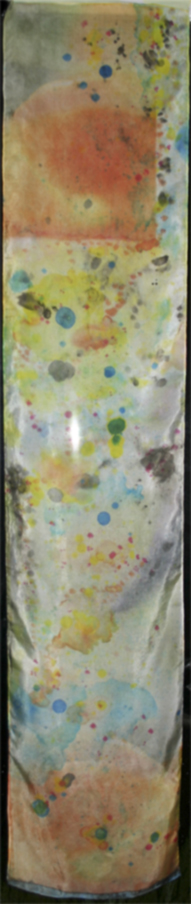
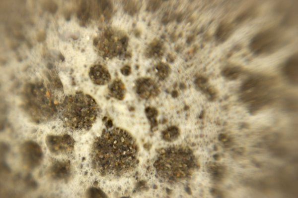
oh boy! i don't know what's up but my new roll of blumenthal is acting completely differently from (than?) the stuff i had before. I guess the main difference is that i didn't worry about how much ink was going down before, set it up like it was paper. but my new roll is clearly unhappy with how much ink is going down! ink everywhere, what a mess!

I'm wondering if the product has this much variation or if the silk I had gotten from my friend was really old or something.

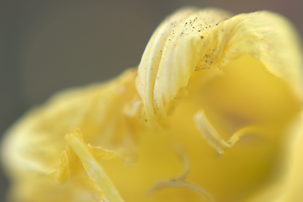
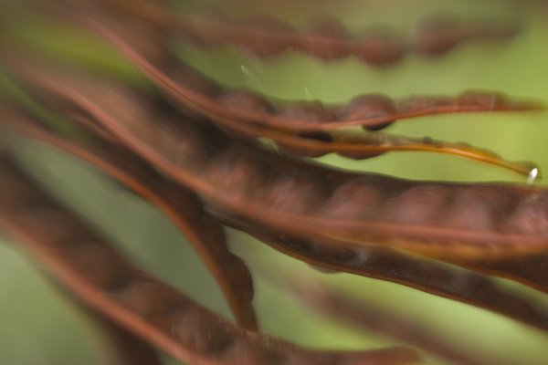
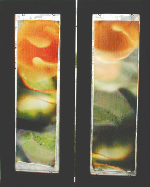
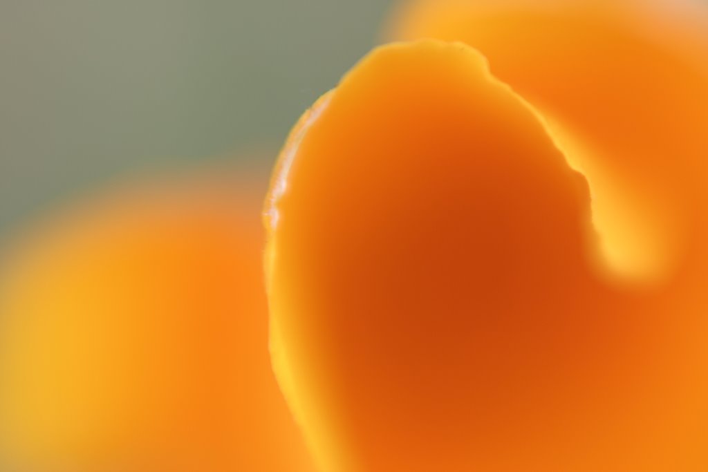
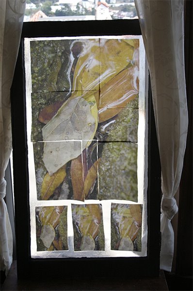
the good news is that except for the extra ink, which i know how to solve, the color is looking good with little adjustment.

in other words it seems to have the right colors but just too much of it all.

i have to wait for it to dry enough to cut it off the roll so i can print the next thing.

as usual i ran into some strange restrictions with the Epson R2400. I'd been using the borderless manual roll setting and feeding cut silk through the roll slot even though it wasn't on a roll.

when i got my new roll i decided to set it up like a real roll. BUT Epson's roll paper sizes don't include 8.5!

Seriously.

i put the roll handling things on the ends of the roll. these things let the roll spin and attach to the back of the printer. they attach fine to the roll but they won't then attach to the printer because the tabs on them don't line up with the slots on the back of the printer.

the roll won't fit on the printer unless it's 8.3 inches! every roll out there is .2 of an inch too big!!!

what are they thinking?

so, being too lazy to start cutting sheets, i tried what i thought was a shortcut. whenever i'm lazy and try a shortcut, i almost always end up doing twice as much work.

this was one of those times.

i left the roll in the roll handing things and put that on a shoe box so the roll sat above and behind the roll feeder. i put the cut edge in the roll slot, just like i'd done with the cut sheet. The idea was that the silk would feed into the back roll slot but with out attaching the roll to the printer.

the Epson took the paper and had trouble lining it up, which it does sometimes. but i couldn't get it to reset properly, pushed the wrong button and instead of it backing up to try again, it starts pulling out _all_ the silk off the roll! O NO!!

a real I Love Lucy moment if you know what i mean.

it gets to the end of the roll and the printer starts spinning like crazy because the silk is firmly taped to the end of the roll and won't come through! The printer is not going to stop til all the silk is thru. i jumped up, reached over and yanked the silk off the roll while quickly ripping the tape off the end of the silk so it wouldn't go into the printer and gunk it up!

So there was all my silk laying curled up on my printer table.

I rolled it back up, put it back on the shoe box, and fed it in the Epson again. yes i _am_ a glutton for punishment.

But before going any further i decided to read the rest of the directions. The directions provided by Epson show being able to choose a banner setting after setting the print perimeters. there is one option option for banner and one for separate pictures with spaces. this tells the printer when to stop. It allows you to to print your prints print right next to each other with no spaces in between.

but i didn't see this option. so i messed around and determined that this option only becomes available when you choose "banner" in page set up first. (so you can choose banner there and change your mind in the next dialogue?) a regular choice of manual roll paper doesn't give you the banner choice.

Ok fine. i chose the banner setting and you won't believe this, i lost the velvet fine art setting! all the others with the good paper profiles have become grayed out as well. what the ___! ?!

How on earth can the printer's ability to stop at a certain point and not advance the paper have anything to do with the paper profile used?

So with a big sigh i fed the paper in there anyway, and this time it set up fine.

it actually fed pretty nicely, until the end when it started spewing all the silk out again! OMG! so reached over and pushed the right button this time and it stopped, and started backing up! oh no! i'm imagining that it's going to back right up into the printer and gunk everything up cuz there's all that extra ink sitting on top of the silk!

amazingly it stopped at what looks like a nice pace to start the next picture if i'd actually sent a full 11 inches to the printer. but the epson believes it's jammed. and i don't want to press anymore of those buttons till i get the over saturated silk off the end.

well i think writing this gave it time to dry. back to work.

yeah it is kinda fun, although right at the moment that i think i'm about to trash my printer.

i'm not laughing!

blumethal silk

I've been testing the blumenthal silk on my Epson 2400 all morning. the only paper profile that comes close to looking good on the silk is the "velvet fine art" setting. I'm on a roll getting the color as i want it and conquering the ins and outs of the back manual feed thing. (i couldn't get to "velvet fine art" without it. )

I just hit the wall tho -- the last print was off and i'm too tired to figure out where to go next.

I wanted to mention that i think it's really interesting that when i print out the tests the colors shift but not the blacks and whites and grays. I use a color test strip that has a section of blocks of B&W from white to black 22 steps, and a ranbow of color, plus little pieces of chalenging art of mine.

when i print it out no color is introduced into the B&W blocks. so if i try to fix a color shift globally i begin to introduce a color shift into the grays! so i think that leaves fixing it with selective color only.

tea dyed fabric

i just made two of my very own tea dyed fabrics. very cool. one is for my dolls that go in the cloth book the other is some lace i'd cut from a curtain that was way too white to be attractive.

the lace i dyed in plain old tea which came out a mellow tan. the cotton i added a bit of chai tea which made it much pinker.

yesterday i finished deconstructing the canvas closet organizer and started the cloth book with the main portion - sewing some batting onto one side, stitching where the page breaks will be. I'm making it a concertina (continuous zigzag) but floppy, in the style of a baby book i saw once. I started working on an image from when i was recovering. my mom took it while i was taking pictures at muir woods.

I like the symbolism, but it's too small not enough info so yesterday's photoshopping goes in the trash. I have others.

Tuesday, September 05, 2006

working with cloth

i just made two of my very own tea dyed fabrics. very cool. one is a plain cotton for my dolls that go in the cloth book the other is some lace i'd cut from a curtain that was way too white to be attractive. I may use some of it in the book and save some for another mixed media brojest.

the lace i dyed in plain old tea which came out a mellow tan. the cotton i added a bit of chai tea which made it much pinker. I tried dyeing a ssoft stretch terry cloth but it ended up just looking like a dirt rag. I tried dyeing it two different times. I don't understand the difference. I'm going to try to rescue it with a coffee dye. I wonder if i can use instandt!

yesterday i finished deconstructing the canvas closet organizer and started sewing together the cloth book using the main portion of the canvas - sewing some batting onto one side, stitching where the page breaks will be.

I'm making it a concertina (continuous zigzag) but floppy, in the style of a baby book i saw once. I started working on an image from when i was recovering. my mom took it while i was taking pictures at muir woods. I like the symbolism, but it's too small not enough info so yesterday's photoshopping goes in the trash. I have others.

Ok be truthful, how much do you fuss with the little tiny threads and hair like fuzz on you silk???? This is definitely bringing out the OCD in me! ha ha ha

I'm getting gorgeous prints on the chine stuff i got from color textiles for my window. i'm excited!

oh, check out this art in a real life gallery:

here's a mixed media artisit who incorporates old photos of her family in her work
http://www.bquayartgallery.com/archive/rayner2006.html (click on the images for bigger versions).

I particularly like the cyanotypes and the looking glass.

and

http://www.bquayartgallery.com/archive/rayner.html
some of her older work.
the thing that looks like a candelabra is filled with wax encased photos of her family.

here's a different artist at the same gallery.
http://www.bquayartgallery.com/archive/austin.html
I see the note that the piece is sold and i really want to know for how much!!

Tuesday, August 15, 2006

black and white

photo macro close up of shell with bluring on sides, mostly grey
really grayscale. i think maybe my latest beach photo, a lensbaby interpretation of a broken shell, is better as a grayscale cuz when i converted it, out popped this face!
so the color was a distraction from the form. it was the color of the grains of sand.
but to add interest i reduced the opacity of the layer that i used for the channel mixer and let a little color thru. this actually made it eery - like a skeleton!

Thursday, August 10, 2006

beach again and color

This morning i went down to the cold foggy, windy beach with my camera, lensbaby attached, and took sand pictures. Fun to revisit the subject from the warped perspective of the lensbaby. But i had the strongest macro lens on and that meant being inches from the subject. So i'm down on my knees in the wet sand, keeping one eye and both ears on the surf so i can jump up when the occasional larger wave sends more wet bubbles my way. I got out of the way every-time but i was wet and very cold at the end. The pics are interesting. see it you can see it with the profile - maybe open in photoshop too see the warm colors - the foam i was shooting was yellower than the foam that disappeared quickly.

macro shot of sand and foam at the beach with strong blur from lensbaby

I've been so wrapped up in working on my widows. following my teaching advise to test your application. I thought i had a great solution to the challenges of transferring photos to the glass when i decided i did not like the look at all and now i've switched to other materials. So i'm back to experimenting before i print out and transfer. the interesting part is trying to get the color i want. When i first thought of transferring images it was because i wanted to move a picture with perfect color from a paper with controllable attributes like a paper profile and consistent professional level paper production to a surface that was more artistic but without the controllability - watercolor paper, canvas etc.
The method for doing that is hard because it involved rubbing off the paper from the back of the acrylic gel emulsion. this killed my hands. So i started working with overhead transparencies and lazertran. they don't have profiles but they seem well made. But with the overhead transparencies i had problems getting clean transfers when i worked big, so i switched to lazertran for my big project. I'm currently in the middle of doing color tests. changing one thing at a time, printing out swaths of color waiting for things to dry, then transfer it and wait for that to dry and then compare with the image on the screen. painfully slow. But the color is important to me. when i worked with the overhead transparencies the first time i was so excited about getting the image to stay on the window that i did not work to correct color problems. but then it slowly got to me, how it was off. Also that it was too distressed ( places of lift where the ink does not transfer). I feel like maybe i'm crazy cuz no one else i know tests this much.
maybe i like testing! i'm the daughter os a scientist afterall ya know!
I have also been working on generating a handout that was supposed to be given for my last workshop. Oh boy, the dangers of cut and paste! the material is mostly a compilation of information at the Golden and Lazertran websites, with some quoted material from the yahoo group, with my running commentary throughout. Boy is it long! It was so unwieldy that i had to actually make an outline to determine the organization i'd given it and rewrite the outline to get things is a more comprehensible order. I can't remember the last time i outlined something!!! I guess i'll ost it here when i'm done.

Friday, July 21, 2006

teaching again

I am so happy to be teaching again!
I had not been teaching the elders at El Cerrito as of late because their schedules were not working with mine.
Then we moved to San Francisco.

Right after moving across the bay I was in a group art show. Art on the Avenues with the Sunset Artists Society. It was my first juried show. I brought along several works in progress. This created many opportunities for conversation. Over and over people said i should give a workshop.

So I did!

It was so much fun for me and the participants.
The class was about transfer technologies and people who came were artists. Photographers especially.

Things i liked about giving the workshop:
It was all my own curriculum, I was not working with someone else's idea of what should be taught.

We explored some new things and some things that are still experimental - that i have been experimenting with.

The people in attendance were highly competent, they were good artists and well versed in using their media.

Somehow it was fun. I'd like to see the key to that cuz sometimes a class won't be and i'm not sure what makes the difference.

Of course i did way too much prep work for it. but i'm assuming that i will get ready with less effort if i do it again.

I also will think more seriously about giving other workshops. I have many in the planning stages.

Since i posted last I have updated my website. See the link above.

Friday, March 03, 2006

e-mailing posts - i still have to

well i'm really not sure i understand the e-mailing posts feature. today i signed on for the first time since i sent in the e-mail posting. it wasn't posted but was saved as a draft so that i could hit the publish button today. very useful! not.
oh dear and look at that formating! what a mess. oh well.

Wednesday, March 01, 2006

test the e-mail posting feature

Today I''m testing 2 features. one is the ability to send the blog to
someone by e-mail. if that worked, and you know who you are, leave a
comments so i know. i've opened up commenting so you can post a comment
even if you aren't a member of blogspot.
the other feature is the ability to e-mail in my blog. with this
feature i write up my blog in my email program and hit send and we'll
see how it turns out.
I suppose this would be useful if you only had dial up.

what happens to a photo when I post it here

I've been experimenting with what happens to a photo when i post it here. I had made a large file for my daughter to print at school. it was a jpeg but i'd saved it with a resolution of 300 and kept the size at about 5 by 5. When i uploaded it here and then right click to save back on my hard drive, the fine folks here at blogspot had kept the dimensions but dripped the resolution to 72. So this is definitely not the way to share a file that you want your grandma to download and print. This is very interesting!

my girl

Here's a shot of my girl, ain't she the best!

Sunday, February 26, 2006

waitng too long

I've been away too long. I was busy with my mom who had an operation, and then i finally had time to address the mess i left my studio in. My studio is a corner or the cottage in the back of our house. i suppose it used to be the garage. It's just one big open space with no insulation. or even an inside wall, just the bare boards. One corner is my daughter's bed room, another is a sort of family room set up, which my daughter uses as part of her room, another corner is the bathroom which we really only use to wash up from my studio, and the final corner is all my art stuff. I have about 9x12 and i am grateful for that. I could use about twice the space. When i was finishing everything for the holiday fair i kinda trashed the place. and my computer was a mess, I save copies of things all over the place. Boy do i need a standard workflow.
When i returned to the studio i had to take everything off of one of my backup drives so my son could take it with him, so i sat down and painstakingly went through all the versions of all the images i have and got rid of the unnecessary duplicates and made sure i had organized backups, both on the discs and on all my DVDs. Then i looked around and saw the chaos which was my art materials. So I spent a week reorganizing all my stuff, and i still have to fix up the sewing corner. Finally I returned to the computer, knowing that i really needed to revitalize it. I spent the whole last week backing up my files and erasing my disk to nothing, reinstalling the OS, updating it; reinstalling all my software and drivers and updating that!
During this time i made some art, i made a few quickie books and took tons of pictures to experiment with new techniques. I'm looking forward to seeing the photos that i took at dawn down at monterey.

Wednesday, February 08, 2006

standup bass


I have no idea why I had trouble uploading photos in the beginning. Every time i tried to upload, i was taken to a page that wanted me to download Hello, which won't work on the mac. So i spent time finding ways to post fotos here without using Hello. But then, just the other day, here was this normal interface that let me upload fotos and post them in my blog entries. Whatever.

Here is a photo of mine. normally i love it but i'm not at my own computer and the colors don't look right. Anyway, people always want to turn this pic in a different direction because it's hard to tell what's going on. This fellow is playing the stand up bass while laying down, with the bass on his belly! I'm squatting near his head looking down the length of his body and the standup base. In the print version the rich colors and textures of the wood and his hands, contrasted with the black hat and the light greenand yellow background make for a nice abstract. If I could do it again, i'd like a little more light on his face.

Sunday, February 05, 2006

Yes that's my kids

Great shot my kids took of themselves. rule of thirds and all that! So it was very easy to upload and post that photo. but again I'm confused because the interface looks different today????

Tuesday, January 24, 2006

I love not depending on windoz

As I mentioned in an earlier post I don't like having to use windoz to do things. I have to use my husband's machine and, well, I'm just plain partial to my Mac (i love my mac! i love my mac! i love my mac!). So i was frustrated trying to post pictures here at blogger. Now i'm sure there are many ways around this but, as i understand it, to upload photos i have to use Hello, which is part of Picasa. these are all free programs that run on windows machines only. I had been testing Picasa and how it works with Hello and Blogger when i started this blog. So of course I was on my husband's machine. But I don't want to be there all the time, and my pictures are not on his machine so... to upload from there I have to move the pictures first, which is not that bad because i've networked the machines, but then i end up with extra copies all over. ugh. so I found a way around it. I have a silly blog at Xanga, just so i can make comment's on my daughter's Xanga site. But at Xanga, it's easy to upload photos, so I uploaded the photos seen below and simply copied and pasted it's link in a little html, dropped it into the blog editor and ta da! the photo shows up right smack in the middle of the post. Hurray for me!

Who wants to see my silly blog? OK here's the link. http://www.xanga.com/kaylarus

This is a fiddler at the 4th of July concert

CRW_0708

Radiantvista daily reviews photoshop workbench etc

Since i've started teaching digital photography to the elders, i have found some really fantastic educational sites about photography on the web. Radiantvista is currently my favorite. The front page has random photos that are very inspiring so that each time you drop by there's a new one.
Everyday i check out their daily critique. Brave souls send in their shots and the fellas give a detailed critique. They start with what they like best (quality of light is a big one) and go into detail about what's good about the shot. Then, about one third to one half the way through the presentation, they switch to what could be improved about the photo. It's interesting the way they can make a photo that was good look really great with a simple crop, color correction, or creative use of the spot healing brush! Then, right before the end, they summarize what's good about the photo and they always thank the folks who submitted the photo.
I love these critiques because for me it reinforces that close critical eye that we need to use when taking the shot and when editing in photoshop. (I also like to guess what improvements they will make and it's fun when I'm right)
Speaking of photoshop, there's another section of the site dedicated to showing in detail what you can do to improve a photo in photoshop. Some are basic techniques, like how to drop in a new sky, and others are more advanced, showing consistent workflow, use of masks, color correction with adjustment layers and so on.
Another part of the site has video tutorials. These are long and amazingly detailed. Like the daily critique, the videos run on quicktime which is so much better than windows media player. All you Mac users already love Apple's Quicktime but for you all still using windoz go here to download it:
http://www.apple.com/quicktime/download/win.html .
My absolute favorite tutorial is the tutorial on composition. This is the class that i had the hardest time teaching because every resource that i found had yet another take on it. But this tutorial is so comprehensive yet clear and simple it's accessible for everyone.
They also have PDF tutorials for those of you who miss reading. Seriously though, these are good for opening up photoshop and working along side. Also in PDF format are some articles, or at least the first one about "The Myth of Talent" which makes the point that you need to work at it and even if you are not that good to start out, if you keep at it you can get really good. I'm not sure this is always true. I don't think it would matter how much i practiced singing for example.
Radiantvista also has podcasts. I feel like such a techie when i download these to my iTunes and play them. Yet it's a real throw back because it's like listening to the radio. I don't own an iPod, but i suppose if i did i could listen to the shows on the run. The shows tend to go into depth about a technical subject like the one about using the RAW format to your best advantage and the latest one about how to use charts that tell you when different stages of twilight will happen where you want to shoot, so you can know when to get out and get that great landscape in the best light possible.
Why do these guys give away so much knowledge? Well besides being in love with what they do, the site also promotes their workshops. Unfortunately for me they are not giving one in my area anytime soon, but i'll be the first to know when they do! What could be improved in a perfect world? Well getting a woman photographer on board would make me feel more at home, but that's just me!
So I give the site an enthusiastic five stars.

Monday, January 23, 2006

trying to find a work around link to cancerwontkillshullady

I like this blog because I can make it look the way I want more than any other. I am testing blogs because i think that the over 50 population, like those in my digital photography class, will benefit from using blogs because the can communicate with friends and family in a creative way. I have a friend who is using a blog as a journal throughout her battle against breast cancer. It really seems to work for her both as a journalling tool and a way to keep everyone informed of her progress. For me this would be a great way to create an artist's journal, but i have a technical difficulty that i must find a work around for. The usual way to post pictures is using picasa and hello. but those only work on a windoz box. which i could manage if i had to cuz after all my dear husband has one of those machines i love to hate like the bad girl in a soap opera. but i don't want to! i take it as a personal challenge whenever i find something that won't work with a mac! I think the work around is the link aspect. If i can upload the pictures anywhere on the web i will be able to link to it and it'll show on my blog. well enough for today.

Sunday, January 22, 2006

trytryagain link to dancingmyassoff blog


this is a pic of my daughter and friends that she messed with is photoshop express. I'm using that version of photoshop so that i can teach it to the elders in el cerrito. it is different than photoshop cs, most notably in its lack of curves. but as my daughters' photo shows, you can still do cool things with it. I posted it here using picasa and hello from my husband's computer. originally the idea was to link it to her blog over at xanga. it seemed to work at first but then it became moody so i figured out how to upload pics to xanga so she could link to it at her site directly.