Showing posts with label printing. Show all posts

Tuesday, March 15, 2011

my set up for printing on silk

Here's a photo of the way i set up my work table:


it shows how i put down some cardboard cuz the table is rough and then i layer graph paper so i can have straight lines for reference. the first thing to do is to wash the silk. i purchased some professional but environmentally friendly soap from Dharma Trading when i purchased the silk. then it really should be fully pressed before you begin attaching it to the backing (i skipped this and paid in the end!). You should do this on a hard surface which can handle the heat.

here's a photo of my favorite papers to do this with:


The parchment paper is to use on top so your iron doesn't mess up the silk and the freezer paper doesn't mess up your iron. You can use what you like for this, but be warned that regular wax paper will melt and ruin your silk. i like so see thru to the silk so i don't use a cloth for this. The freezer paper is the star of the show for me. I know of no other brand or sizes available. around here only the Safeway seems to carry it.

in this next photo i'm using the closest thing i had to a "T" square to insure that i am laying out the freezer paper very straight.


if the paper is at all not perfectly straight the printer will go crazy.
In this next image i am using the wide masking taper to measure out the amount i have to cut off the width of the paper so that it will fit on my 17 inch printer. darn paper is 18 inches wide.


in this photo i've laid out the silk.


i wonder why i stopped to take this photo? i probably knew darn well i should have pressed this silk before i laid it down on the freezer paper. the day before i'd washed and pressed it and then folded it up in a hurry to do something else.

these next 2 shots show the whole sandwich. the shiny freezer paper, the silk scarf with it's tiny hem, and the parchment paper on top. see how you can see through the parchment to the silk?


these show how you can even see the edge of the freezer paper through the parchment paper as you press the silk to the freezer paper. What's going on here? the coating on the freezer paper is some kind of silicon or plastic. when i set the iron all the way up the coating gently melts and holds onto the silk.


You can also see the blue artists' tape that i made meticulously straight and at right angle to the uncut edge of the freezer paper. this is what makes the whole thing work for me when i insert it into my printer. the edge is slightly heavier than to too light freezer paper and it lets the printer know exactly where the front edge is. the printer can become confused if it sense the edge of the paper and the edge of the silk.

Please note that i should have looked at my old notes at this point. the way my printer works in the banner setting is it creates an extra leading edge. it rolls the paper 7 3/4 of an inch too far before it starts printing. this is easy to fix when you anticipate it. simply use a larger piece of freezer paper than you need and back the silk up so that it starts 7 3/4 inch (or what ever distance your printer adds) from the front edge of your carrier paper.

Although everything looks smooth a beautiful in these close ups it is not! check out the bumps i left in it! DO NOT DO THIS.


Here is the chute i build with chairs and boards and things i found around the house. i laid an old piece of freezer paper down over the whole thing to make a nice smooth slide. The paper goes over the cover for the roll paper which has been removed and down into the roll paper feed.


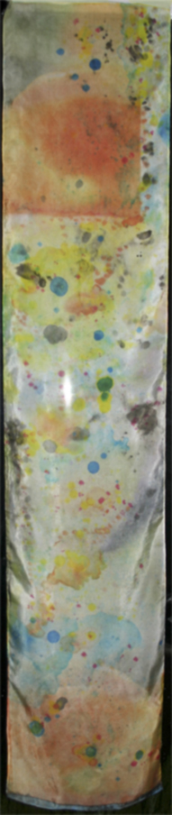
and the printing has begun! you can see the lively colors, the 7 3/4 inch gap (arrggg) and the beginnings of trouble in the form of black smudges on the edges.


Here's the printer hard at work. i watch for trouble through the smoky lid showing the print head laying down the ink.

the trouble did not get out of hand completely, where the silk lifts completely off the carrier paper, but here's two close ups of how a small weakness grows:


Friday, March 11, 2011

printing on silk: reflections

quick notes on the printer set up, photos to follow.
w/ Epson 4880 & my mac I need to create custom banners to print huge. the IMAGE width must end in .34 (17.34 for a 17 inch wide print) if you want retain size not auto expand as I do. the custom paper size must add .1 for the length and .23 to the width. this will cause a warning about clipping to come up every time you print. just say ok.
up to the 52 in long scarves I was able to print borderless, w/ 0 margins all around in the custom paper and "borderless roll retain size" in the Epson printing dialogue box. but yesterday the printer refused to print borderless so I ended up adding a margin in the custom paper size and changing the paper source in the Epson printer dialogue box.
note that the printer itself kept defaulting to a cutting state, even tho I set no cut in the software. need to change the default setting on the printer for now cuz cutting in the wrong place would be a mess!
also, the current image can be about an inch narrower and i'll get less spillover onto the paper.
need to attach scarf with 5 inch lead of paper because in the banner setting the printer pushes thru extra at the beginning.
I set the ink density to +20 which was clearly too hi. I had used a +10 setting on that silk on a roll I used last and that had been to low.
the image blurred a lot. it looks good but i'm wondering if I can get the detail back when I want it buy reducing the ink density or need I get the digital ground Heidi recommends?


- Posted using BlogPress from my iPad
kayla garelick, daydreaming artist
http://daydreamingarts.net
http://facebook.com/kayla.Garelick

Thursday, July 05, 2007

Altered Barbie getting ready

Photo depicts "Barbie's Hood Ornament" by Leigh Radtke.
Well the Altered Barbie show is coming closer. I'm running like mad to get organized. the press release went out, the post card is at the printers I actually had some input, but mostly i fixed the issues with the logos for the sponsors in the press release.
this is just the sort of thing i'm good at. problem solving on the fly.
the first acceptances went out. there are actually some artists who don't have email and that makes it hard to contact them, snail mail is well, ... slow! so i won't publish all the names yet.
I actually made a spreadsheet - yeah i know!! this is tough for me of course with the dyslexia and all but i have to get some skills in this area. i need them for Frank Bette Center for the Arts too.

I went out and purchased the domain name for altered barbie and set it up with a real life server. there were lots of little bugs at first, several caused by my inexperience! but i worked it through with tech support.

So now i really have to update the Altered Barbie site and blog and our pnn.com interactive news site cuz so many details have firmed up. I also have to start adding artists pages and gather artists info for the book and website. Oh and the sponsers! (of which daydreaming arts is one!)

I love working on this show but i've been doing it pretty much non stop for two weeks now with just a short break to help with intake at Frank Bette last Sunday. Boy was that demanding!!! Also I did my shots but have yet to print them cuz my printer still hasn't arrived (another crazy story) and i've been working hard on helping Sarah with her dioramas. getting Barbie to stand up is really hard!!! Oh and Sarah and i were at the mall yesterday and we started planning what we will wear to the Barbie Ball, it's getting so exciting!!!!!
so i'm heading over to the blog right now.

Thursday, March 22, 2007

spring at last or Seeing Grean


i've been so incredibly busy lately and the weather has been so fine, i haven't sat still long enough to write a blog in quite some time! this flower petal isn't even a spring flower! it's from the dead of winter -- which around here is not so dead!

the TV of Tomorrow show last week was FANTASTIC! what fun we had! mostly the techies kept to themselves and the artists kept together, even though we'd never met before. the show was a conference for folks who work in the development end of interactive tv. the idea was to explore the possibilities. in keeping with that theme our art all had something to say about tv and many of us imagined where it might go.

one piece was a robot that was peopled remotely. there was a tv screen with the person's face broadcast live and you could talk to her and she'd talk back. the robot could move around the room because it was wireless. this was created collaboratively by some art students. it became the intersection for the artists and the techies. being so overtly techie as a piece it was easier for the techies to approach.

the was also a student journalist there so i had my first newspaper interview. i wonder if her published anything!

on Sunday i drove up to Petaluma to pick up my art from the Aurora Colors Gallery and had a nice chat with the owner. in the car i switched out frames cuz i hated that Plexiglas and took that piece and two others down to Ben Lomond for the "Seeing Green" show at the Santa Cruz Mountains art center http://www.mountainartcenter.org/

so i will have three rather green pieces there- the show opens friday night with a party and goes for a month. i still have work up at the Frank Bette Center in Alameda. for now it's in their "Green" show and that will be follow by our Alameda on Camera work. all 40 photographer's and our vision of the city!

i'm printing out - for the fourth time - the piece for that show as i write this. it has a great story behind it which i will share when i post the image here. i'm reprinting it to get the sharpening just right. it's very textured and it looked to grainy, then too blurry, and then grainy again.

i ended up sharpening different parts of the image differently. over all used "High Pass", for which you have to make a copy of your background layer because it is a destructive filter and when you are done you blend it with the original layer. I have some of my own tricks that i've added to this hidden gem. i like making the hi pass layer black and white to avoid adding a color cast and playing with the blending modes and opacity.

i made a separate layer for sections of the picture that had unique issues. one part for example, was so deeply orange / red that it was loosing detail when it printed. rather than desaturate (which i'll try if this doesn't work) i put this part on it's own layer and sharpened it in such a way as to emphasize the hidden yellows. this created a more textured look and lessened the orange / red blow out.

it's coming out of the printer now. well i won't decide til tomorrow whether i need to keep working on this image. often the print changed a bit as it dries over night.

Wednesday, December 06, 2006

now i know how Jackson Pollock got his start!


now i know how Jackson Pollock got his start!
he discovered that the paint companies were ripping him off by making it seem like the paint cans were empty when in fact there were gallons of paint left inside. but the only way to get the paint out was to poke holes all over the cans and whack them, throwing paint every which way in his studio. some of it landed on a canvas and he kept it a secret cuz he figured punching holes in the paint can was probably a copyright violation for reverse engineering them!

similarly i now have Pollock-esque scarves having discovered that those "empty ink canisters from Epson don't have a few drops left when they tell you it's empty. there's the whole Hetch Hetchy Reservoir in there!
i started out all controlled taking little drops of pigment out of the holes where the air locks are on the bottom. but soon they were leaking everywhere - especially that crazy cyan. soon enough i was feeling my anger boil and my sense of humor take over and i started whack the so called empty canister onto the silk scarf i was working on.
talk about abstract!

well it won't sell but i will wear it proudly to proclaim that i did not reverse engineer it, i got what was rightfully mine!

in this drawing (from MOMA's website - follow link in the title to this post) Pollack has discovered that the black and sepia ink containers have hidden reserves of ink the company never intended he be able to use. just pay for.
Jackson Pollock. (American 1912-1956) Untitled (1951) Black and sepia ink on mulberry paper Gift of Lee Krasner in memory of Jackson Pollock © 2006 Pollock-Krasner Foundation  Artists Rights Society (ARS) New York
Jackson Pollock. (American, 1912-1956). Untitled. (1951). Black and sepia ink on mulberry paper, 25 x 38 3/4" (63.5 x 98.4 cm). Gift of Lee Krasner in memory of Jackson Pollock. © 2006 Pollock-Krasner Foundation / Artists Rights Society (ARS), New York

Friday, September 29, 2006

more on doll faces

well i couldn't sleep this morning so i got up and finished stuffing all the little hands for the dolls in the book. and then i cut out the first of the faces. ironed the back off the blumenthal silk and sewed it to the tea dyed cotton back of the head.

My concern had been that i'd printed the faces too close together and wouldn't be able to sew the face to the back for lack of a seam allowance. Well i had to sew close to the edge so i sewed over it 3 times. I know from stuffing the hands that if the seam allowance was too small, it would break right through when i stuffed it. and my machine has limited capabilities so the smallest stitch is not so small. It came out fine. it's a smaller head overall than i'd pictured in my head, with no space between the end of the image and the start of the cotton for the back of the head. But it looks fine cuz it's a grown up head. i think for the baby and little kid faces i will be sure to print with a seam allowance in mind so the head can be rounder and the face set off from the back.

doll faces

I'm making a fabric book that has little rag dolls in it. their fasces are photos printed out on the silk.

I'm using some the baby pictures i had scanned in. They are some old black and whites that i then made look as tho they were hand colored using Photoshop.

I remembered my previous efforts at actually hand painting a print and i knew i needed that undo button on the computer!

I used a painting layer. i then blended the layer using "color" or "soft light" blending mode for the layer. One got complicated around the eyes and i ended up having three layers, one with just the eyes repeating, blended with "soft light."

of course i spent way too much time fixing up the old photos. I'm also using images of grown up shots that are mostly old IDs i scanned in. one was a NY driver's license which puts a moiré pattern over your face. many of the lines for the face are lighter than the moire pattern cuz it was over exposed. But it's the fading away that i liked about it, so i actually spent time erasing these lines so you could make out the face!

OCD and tiny threads!

Ok be truthful, all you who work with this silk you can print on -- how much do you fuss with the little tiny threads and hair like fuzz on your silk????

This is definitely bringing out the OCD in me! ha ha ha ;-}

I'm getting gorgeous prints on the chine that i got from Colortextiles for my window.

i'm excited!
I 'm simultaneously sewing the little hands for the dolls for the cloth book. I can sew and stuff an arm in about the time it takes to print out a panel for the window!

colortextiles and light

my Colortextiles samples came and i really like the crepe de chene "14" for the window project. it's got the right amount of variation in the thread and seems to throw more light. I think I'll use the blumenthal for cloth books cuz it seems stronger.
As i was falling asleep last night i saw one side of the window with silk and the other with a gel transfer.

humm... i wonder how that would really look.

I signed on to the fabric group at yahoo groups and i'm reading through old posts.

I'm going to move my studio into the living room and the living room into this room, which is the dining room. I will get alot of resistance but i'm in this house all day and they are here for a few hours everyday. Morey's "study" (my son's bedroom when he's not in college) is bright and sunny (when there is sun in this fog belt) and it has access to the deck. my daughter's room is twice the size of our bedroom and she pretty much has exclusive use of the family room, which is the same size.

The dining room where my studio is has no natural light. it's window looks out to the front stoop which has a roof and a gate. the stoop has a sunroof but it doesn't let much light through.

can you tell i'm shoring myself up?

more on printing on blumenthal silk

this morning i ironed the sample from last night and pulled off the backing. it looks lighter, and seems to have left behind some yellow, but i don't miss it.

so i might only want to reduce the ink desity only 25% - depending on the purpose of the piece.

i found it sticks to the glass nicely when i use a mix of Golden's soft gel gloss and GAC 200. I'm testing to see if it looks a little more translucent if i wet it first so it absorbs more water from the gel. But it's tones better than the lazertran for looking glowy in the light.

I did loose some detail. Should i do extra sharpening? hum...

i also ordered sample packs of the Colortextile cotton and silk. I went ahead and ordered some ink from them as well cuz they have a baseline shipping cost per order. I don't have the cash flow to order a whole $100 worth of stuff to get free shipping. Sheesh! at amazon it's only 20!!

and i am interested in the organza but i have to wait til next month..

color correcting blumenthal silk

well I spent a whole lot of time messing with the curves in Photoshop, trying to get the color right on the blumenthal silk. I have gone full circle and i'm really scratching my head on this. basically one way to fix a picture is to take a curve on an adjustment layer (if you have elements use selective color i suppose -but the curve is so neat to look at!) and make the screen look like the print out and then make a new adjustment layer curve with the opposite info! but the bottom line is that something that seemed to have stopped working (switch input/output numbers) is working again.

an interesting thing is that curves is represented as a line indicating from 0 (darkest) to 255 (white) on a pure diagonal. if you pull the line up from the mid point, you make the middle pixels lighter and if you pull them down they get darker.

So you'd think the "opposite" of one curve would look like it's mirror. but some how it doesn't. instead it seems that it's upside down and backward! so i'm shaking my head and got my son in to help me think it through.

Anyway. the main adjustments i'm making are tonal just the blacks and whites and grays. i'm learning that the color adjustment can be much less if you fix the tonality first. this is easier for me to do now that i work with this nifty test strip (little squares of white to black in 21 gradations) with a color gradient rainbow thing. I add a swath from the picture i want to print.

i can say for sure that i have to reduce the ink 33% --that really helps (BTW since writing this i have found that silk that i cut and put in a plastic bag and got back to a couple of weeks later did not need the ink reduction.)

well the fix just came out of the printer. it looks ok but i have to wait to see it in the daylight (or should i say fog light!) to be sure. the light in this room is bad. I can see that, from reducing the ink, the dark colors look better and the light colors got too light.

to do the fix in levels slide the mid point slider to the left to lighten the midtones and then on the output at the bottom move the darks slider to the right to lighten the blacks. you could do it in selective color too where you'd lighten the blacks and grays.

instability

the blumethal silk is acting completely different!
oh boy! i don't know what's up but my new roll of blumenthal is acting completely differently from (than?) the stuff i had before. I guess the main difference is that i didn't worry about how much ink was going down before, set it up like it was paper. but my new roll is clearly unhappy with how much ink is going down! ink everywhere, what a mess!

I'm wondering if the product has this much variation or if the silk I had gotten from my friend was really old or something.

the good news is that except for the extra ink, which i know how to solve, the color is looking good with little adjustment.

in other words it seems to have the right colors but just too much of it all.

i have to wait for it to dry enough to cut it off the roll so i can print the next thing.

as usual i ran into some strange restrictions with the Epson R2400. I'd been using the borderless manual roll setting and feeding cut silk through the roll slot even though it wasn't on a roll.

when i got my new roll i decided to set it up like a real roll. BUT Epson's roll paper sizes don't include 8.5!

Seriously.

i put the roll handling things on the ends of the roll. these things let the roll spin and attach to the back of the printer. they attach fine to the roll but they won't then attach to the printer because the tabs on them don't line up with the slots on the back of the printer.

the roll won't fit on the printer unless it's 8.3 inches! every roll out there is .2 of an inch too big!!!

what are they thinking?

so, being too lazy to start cutting sheets, i tried what i thought was a shortcut. whenever i'm lazy and try a shortcut, i almost always end up doing twice as much work.

this was one of those times.

i left the roll in the roll handing things and put that on a shoe box so the roll sat above and behind the roll feeder. i put the cut edge in the roll slot, just like i'd done with the cut sheet. The idea was that the silk would feed into the back roll slot but with out attaching the roll to the printer.

the Epson took the paper and had trouble lining it up, which it does sometimes. but i couldn't get it to reset properly, pushed the wrong button and instead of it backing up to try again, it starts pulling out _all_ the silk off the roll! O NO!!

a real I Love Lucy moment if you know what i mean.

it gets to the end of the roll and the printer starts spinning like crazy because the silk is firmly taped to the end of the roll and won't come through! The printer is not going to stop til all the silk is thru. i jumped up, reached over and yanked the silk off the roll while quickly ripping the tape off the end of the silk so it wouldn't go into the printer and gunk it up!

So there was all my silk laying curled up on my printer table.

I rolled it back up, put it back on the shoe box, and fed it in the Epson again. yes i _am_ a glutton for punishment.

But before going any further i decided to read the rest of the directions. The directions provided by Epson show being able to choose a banner setting after setting the print perimeters. there is one option option for banner and one for separate pictures with spaces. this tells the printer when to stop. It allows you to to print your prints print right next to each other with no spaces in between.

but i didn't see this option. so i messed around and determined that this option only becomes available when you choose "banner" in page set up first. (so you can choose banner there and change your mind in the next dialogue?) a regular choice of manual roll paper doesn't give you the banner choice.

Ok fine. i chose the banner setting and you won't believe this, i lost the velvet fine art setting! all the others with the good paper profiles have become grayed out as well. what the ___! ?!

How on earth can the printer's ability to stop at a certain point and not advance the paper have anything to do with the paper profile used?

So with a big sigh i fed the paper in there anyway, and this time it set up fine.

it actually fed pretty nicely, until the end when it started spewing all the silk out again! OMG! so reached over and pushed the right button this time and it stopped, and started backing up! oh no! i'm imagining that it's going to back right up into the printer and gunk everything up cuz there's all that extra ink sitting on top of the silk!

amazingly it stopped at what looks like a nice pace to start the next picture if i'd actually sent a full 11 inches to the printer. but the epson believes it's jammed. and i don't want to press anymore of those buttons till i get the over saturated silk off the end.

well i think writing this gave it time to dry. back to work.

yeah it is kinda fun, although right at the moment that i think i'm about to trash my printer.

i'm not laughing!

blumethal silk

I've been testing the blumenthal silk on my Epson 2400 all morning. the only paper profile that comes close to looking good on the silk is the "velvet fine art" setting. I'm on a roll getting the color as i want it and conquering the ins and outs of the back manual feed thing. (i couldn't get to "velvet fine art" without it. )

I just hit the wall tho -- the last print was off and i'm too tired to figure out where to go next.

I wanted to mention that i think it's really interesting that when i print out the tests the colors shift but not the blacks and whites and grays. I use a color test strip that has a section of blocks of B&W from white to black 22 steps, and a ranbow of color, plus little pieces of chalenging art of mine.

when i print it out no color is introduced into the B&W blocks. so if i try to fix a color shift globally i begin to introduce a color shift into the grays! so i think that leaves fixing it with selective color only.

Tuesday, August 15, 2006

black and white

photo macro close up of shell with bluring on sides, mostly grey
really grayscale. i think maybe my latest beach photo, a lensbaby interpretation of a broken shell, is better as a grayscale cuz when i converted it, out popped this face!
so the color was a distraction from the form. it was the color of the grains of sand.
but to add interest i reduced the opacity of the layer that i used for the channel mixer and let a little color thru. this actually made it eery - like a skeleton!